Sunday, July 19, 2020

Facebook Live

I've been having fun lately doing weekly, 2 hour, live painting sessions on Facebook.

It's part of trying to learn to embrace the fear of failure. The more I have come to accept that failure is not just okay, but it is a good thing, and a necessary part of growth, the more fun my life has become. And the more fun painting has become. It's about taking risks.

I spent a lot of time trying to perfect my painting skills, make things look like things. But I wasn't enjoying it. In art there is no way to follow a script, a lesson plan, do all the right things, take all the right classes and ensure success. Oh wait! that's true of life isn't it? Hmmm.

Anyway, when I started teaching, and painting in front of others, something shifted in me. You can't do those things without accepting that things might go right, and they might not. There is risk. My ego fought that pretty hard, still does! The first few failures were pretty devastating. But I just kept getting back up, dusting myself off, and putting it out there again.

Why? I tell myself it is because I want to share and encourage others to give it a try. And that is true. But it's more than that. I want to discover what is on the other side of the fear. What doors in myself can I open up, what experiences of connection to the flow of life can I have.

What is out there in the place between the obviously possible and the obviously impossible?

Ah, but I wax philosophical. Here are some recent Facebook Live Painting Session paintings.

You can join me every Tuesday at 1:00 Pacific time. Or stop by at your leisure and watch the recorded sessions.

https://www.facebook.com/karenilariart/live_videos/


Thursday, June 21, 2018

Large Leaf Earrings

Another crochet earring pattern I came up with


Large Leaf Earrings

Materials:
DMC Perle Cotton No. 5 (small amount, ¼ skein or so)
Crochet hook: 00, 1.75 mm
Small tapestry needle or crewel embroidery needle
Ear wires

stitches used:
ch: chain
sc: single crochet
dc: double crochet
tr: triple crochet
sl st: slip stitch
Pic3: Picot stitch - ch 3, sl st in 3rd ch from hook.
Pic4: Picot stitch - ch 4, sl st in 4th ch from hook.

R 1: ch 10 loosely

R2: sc in 2nd ch from hook, dc in next 3 ch,  tr in next 4 ch, 5 tr in last ch.

Now work up the other side of the chain. You can work over your starting tail to save having to weave the end later.

Tr in next 4 ch, dc in next 3 ch, sc and pic3 in last ch (this is the tip of the leaf) , join with sl st to first sc

R3: sl st in the next 3 sts, sc in next st, dc in next st, 2 tr in each of next 4 sts. (dc, pic4, DC) in next st (this is the stem of the leaf), 2tr in next 4 sts, dc in next st, sc in next st, sl in next 3 sts. End, leaving a long tail – a couple of feet.

Center vein: 
Thread the finishing tail onto a crewel embroidery needle. Weave down to the  tip of the leaf. Chain Stitch back up the center of the leaf (you can find tutorials for chain stich on You Tube), ending at the stem to create a center vein. 

Finish off and weave end.

Attach ear wire to stem.

You can stiffen your earrings with a bit with spray starch. Place earrings front side down on a towel. Spray back with Heavy spray starch and let dry.


Here is a link to a printable PDF version

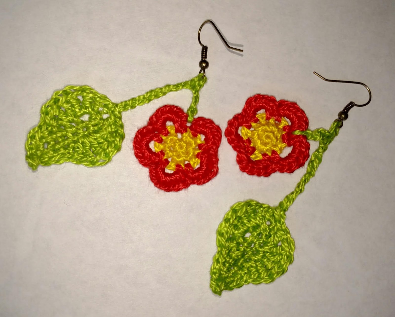
Crocheted Leaf and Flower Earrings

Something else I love to do besides painting! Crochet and knit!

So these little earrings are my design and I wanted to share them with you


Leaf and Flower Earrings


3 colors DMC pearl cotton no. 5 (you will need only a small amount of each color. You could make 4 or 5 sets with one skein of each)

Size 00, 1.75 mm crochet hook

(pc3 stitch is a picot made my chaining 3 and sl st in the 3rd chain from the hook)

gauge is not critical.


Flower

Start with Magic ring and color 1

R1:  5 sc in ring don’t join.

R2: working over starting tail.  2 sc in each of the 5 sc (10 sc) join with sl st to first sc. End

With color 2:

R3: working over end of last color. Join with a sl st and sc in same st as join.  ch 3, *sc in next 2 sc, ch 3. Repeat from * 3 more times (5 petals) sc in next sc. join with sl st in starting sc.

R4: working over this color tail. 5 sc in ch 3 loop, *sk 1 sc, sl st in next sc, 5 sc in ch 3 loop. Repeat from * 3 more times. join with sl st to beginning sl st.  End.
Weave in final tail.

Leaf (use either this larger leaf or the smaller one)

R1: Ch 7 loosely, sc in 2rd ch from hook. Sc in next 4 ch, 3 sc in end ch, 
now work up other side of chain (working over starting tail) , sc in next 5 ch, 3 sc in last ch

R2: Dc and 2 tr in first sc. 2 tr in next sc, dc in next, sc in next 2sc, sc pc3 in next, sc in next 3 sc, dc in next sc, 2 tr in next sc, 2 tr and 1 dc in next sc, sk 1 of the 3 sc on the end, sl st in the next 2 sc.

Stem: Ch 12, sl st in 3rd ch from hook, ch 3, join to flower with sl st between petals. End.
Weave end back through ch to leaf.

Smaller Leaf

Ch 5 loosely, sc in 2nd ch from hook, dc and tr in same st, tr and dc in next ch, dc in next ch, 2 sc, 3pc and sc in end ch.
Working up other side of chain (and over tail) dc in next ch, dc and tr in next ch, tr, dc and sc in next ch. Join with sl st to first sc.

Stem: Chain 9, sl st in 3rd ch from hook, ch 3. Join with a sl st between 2 petals on the flower. End.

Weave end back through ch to leaf.

You can stiffen your earrings with a bit with spray starch. Place earrings front side down on a towel. Spray back with Heavy spray starch and let dry.


Click here for a PDF file that you can download

Thursday, January 11, 2018

Basic Color Schemes

Color Schemes

Sometimes giving yourself limitations when you paint can help to get your creative juices flowing.
One way to do that is to choose a Color Scheme.

Here are a few that I have used, there are more. I also use these as sides of a die in my Art Inspiration Game which you can read about here   

These first few have to do with the good old Color Wheel. 


As you know, the Primary Colors are Red, Yellow and Blue. All the other colors can be made by mixing these 3 colors together.
The Secondary Colors: Green, Orange and Purple, are made by mixing two primaries together.
I don't have them shown here, but Tertiary Colors are made by mixing two adjacent colors together. So yellow-green or red-orange for example.


A Complimentary Color scheme means choosing 2 main colors that are Complimentary, meaning directly across the color wheel: Examples are: Orange & Blue, Green & Red, Yellow & Purple. Here is an example:


This has a red/green
complimentary color scheme.


Another one is Split Complimentary That would be choosing a color, and then the two colors on either side of its complimentary color. You can do this with a color wheel of primary and secondary colors like the one shown above, or you can expand the color wheel to include the tertiary colors. So in this scheme you might choose Purple - Its compliment is Yellow, either side of that is orange and green. So your scheme would be Purple, Orange, and Green.
This painting is pretty close to that:


With all of these schemes, it doesn't mean you can only use only those colors, just that it should be your overall experience of viewing the painting.

Analogous: Those would be colors next to each other on the color wheel, either 2 or 3: green & blue, or green, blue and purple. yellow and orange, or red yellow and orange.
Here is a yellow/green/blue analogous painting


Moving away from the color wheel specifically, here are a few more schemes:

Saturated: 
You can find many examples of this in my work because I love color! Saturated just means a lot of pure, rich color. Often straight from the tube.


Neutrals: This would just be a painting that has primarily neutralized color. Nothing too bright or vivid.
Here is one like that:
Or at least as neutral as I usually get, :) I like color!


The last scheme you might choose would be any 3 tubes + white. So you would just choose any 3 tubes of paint, probably some type of yellow, red and blue so you could mix other colors. But it might be more fun to challenge yourself by choosing something more difficult ! The painting I used above as an example of Split Complimentaries - The Fall Color was actually done with just Hansa Yellow Medium, Napthal Red Light, Ultramarine Blue and White.

So, whether you are playing my Art Inspiration Game, or just looking to limit your options to spark your creativity. Try choosing a Color Scheme for your next painting!

Thursday, October 12, 2017

What Should I Paint!

Did you ever finish up a painting and just get stuck? What should I paint next?!


There is a simple answer to this, and one that gets to the root of why I paint at all.

Paint what you love! 

Okay, I know, pretty obvious. But so often I find myself going down the rabbit hole of:
  • What I think might sell
  • What has sold in the past
  • What I think the juror of a particular show I'm trying to get into might like
  • What another painter, whose style I admire, loves to paint
  • What I happen to have photos of
  • Where I happen to be
  • What I think I am, or am not, capable of painting - as in "I can't paint people"
And sometimes I can even come up with a decent painting with these beginnings. But it's rarely much fun!

 The Root 
Expressing who you are. You are the only one of you ever in existence. All your little quirks. The colors you love, the things you love, the activities you love. Notice I'm not saying the things you kinda like? Discovering what you really love, what makes your heart swell, what brings a smile to your face is so important. Hold on to those things! Write them down. Dwell on them. When you are sad or anxious, run through that gallery in your mind. 

Those are the things that make you feel alive! 

For myself, for some reason, I never learned to do that. I often looked to others to approve or disapprove of my choices. Never really enjoyed the things that I love! So I'm writing this blog for myself, and you. As a challenge to be mindful of the things that you love, start a list! And then 

Paint Them!

Your style, your expression, your unique contribution to the art world is based on this idea.
I'm starting my list today. Are you in? Share your list on our Facebook page! :)

Here's something I love :)


Thursday, August 24, 2017

Painting Large Loose Florals

Painting Large and Loose

There are a couple of ways to approach a large image like this one. For that matter - any image!

You can draw out a detailed drawing and then fill it in. Or you can just start laying down large shapes, and then refine the image by breaking those larger shapes into smaller ones.

I went with the second approach on this one.

Acrylics are really well suited to painting this way. You can go back in with as many layers as you like. Trying different colors, shapes. Without ending up with mud, since the layers don't mix. I love that! It's an adventure in discovery :)


This is the finished painting. Acrylic on canvas. 18" x 24"

The Winding Road 

Here's the photo I took in my garden to start with. 

I love the color and shapes, but knew I wanted to work on the composition

It's important to realize that even though you are planning on trying to paint loosely, you still need to plan your composition, your color harmony, your story.

first, I decided to go with a portrait oriented canvas, to emphasize the vertical nature of the flowers.

So I took the image into Photo Shop and made some adjustments.

I lightened, blurred the background stalks. I also washed over them with a bluish tone. This was to give more of a sense of depth to the image.


 Next I moved the right hand stalk down to give more variety of height and to fill in the lower area.

Then I moved the petals in the upper left down to the bottom, and moved the nearest green tipped stalk over to the right more. It had a directional shape to it and was pointing us out toward the edge of the image instead of in toward the middle.

Then I just did some copying of various areas to fill in that bottom area with random petals.

If you are interested, I made a short You Tube video on how to make these kind of adjustments in Photoshop. You can find it here  https://www.youtube.com/watch?v=6_z_R1gRAH8&t=25s

Time to Paint! 

I started by toning my canvas with some of the colors I thought I would use. Doesn't this remind you of a Big Stick popsicle?!

This gives me a chance to experiment with my colors and start to understand which mixes were going to work for me.

I know I want to keep this loose and remember that my story in this painting is the color. 

Colors I'm using: Titanium white, Hansa yellow medium, Quinacridone gold, Napthol red light, Quinacridone Magenta, Alizarin Crimson, Ultramarine Blue, Hookers Green     


 Next, I started defining the overall shapes by painting a blue grey background color around the shapes. This is called "negative painting". Instead of painting the flowers, or the positive image, I painted the background in around them.

This is really fun to experiment with. The outcome tends to be more loose, with less of a controlled look. You should try it!

Then I came in with some darker colors for the shadow shapes. Further refining the forms.

Lots of squinting here. Avoiding detail. Using a flat firm brush about 1 inch wide. Just look for those big shapes and boldly place them with simple strokes. Keep moving around the canvas to build up all the areas at once. Don't fuss, overpaint, or fiddle. It's not easy! I have to remind myself many, many times! No detail!!

 Adjusting the Background

At this point I decide to darken the background and push it to a more greenish blue color.

My thought was that it would help the lighter colors pop more against the darker background. And the Complimentary blues and greens would also give more of a pop to the reds and oranges.


 Finding the Forms

My focal area is going to be the blossoms in the lower left third of the painting.

So that is the area that I want to have the most detail and contrast.

At this point I had spent quite a bit more time breaking up those larger shapes into smaller more accurate shapes and colors. 

Still working with my 1 inch brush.

Going back and forth between light and dark values to try to define the roundness of the forms.

I'm using my reference photo, but also a real flower that I have in a little bottle, lit with a spotlight. Notice how loose I'm keeping the background blossoms and the blossoms at the bottom and sides. Just big strokes of color in blossom like shapes.

At this point I let the painting sit for a couple of days. I wasn't happy with the background. And I didn't like the color and forms in the green buds. Hmmm. I like to keep a painting like this where I can see it many times a day. In different lights, in different moods. I just keep glancing at it hoping it will tell me what it needs. What? Don't your paintings talk to you?! ;)

  Light Bulb!

Ahhh, that was it. The background was all wrong!

I was trying to create this soft, richly colored world. Harmony was what I needed, not contrast! Having the blossoms pop off the page was not as important as creating this color mood. Sort of an enfolding atmosphere.

So back in with some Ultramarine blue and white, neutralized a bit with the same peachy tones I was using in the flower.

I also lightened, cooled and softened those background stalks a bit more.

Then I spent more time with lighter versions of the pinks and oranges in the foreground flowers. Experimenting with forms, color, shapes. Remembering to keep the most definition in my focal area - softening out to the edges.

At this point I have switched to Golden "Open" Acrylics. These take longer to dry than the regular heavy body acrylics I started with. You can't do much layering with these though, which is why I only use them toward the end of the process. what they do is let me do a little more blending of the colors. I know I don't want to be too "blendy though, I want to keep the brushstrokes showing for a more loose look.

I'm spending a lot of time thinking about the way the light - coming from above - will hit the various angles of the petals.

  Final Touches

I wasn't happy with all the buds and shapes on the stalk on the right. It wasn't looking so much like snapdragons. More like a gladiola or something :(

So I added some larger half open blossoms. with just 2 or three brushstrokes. Shadow color, mid tone, highlight. I worked on de-emphasizing the top of that stalk as well. Lighter colors, softer blending.

I also brightened up the yellows (Hansa yellow medium, with a touch of quinacridone gold in the shadows, and white in the highlights.

Added some darker darks and lighter lights. Reshaped some areas that were bugging me.

At this point I just step back and squint my eyes. Or glance at it quickly. If something grabs my attention, just seems wrong, I adjust it.

I've spent enough time with the color mixes, and the forms, at this point that I can paint more intuitively. For me it takes this process of spending time, trying things, getting to know my subject. I will often go through a stage where I start to get detailed and fiddly and blendy, and then I go back to bigger, bolder strokes. I often sit at my easel in the early stages of a painting, but in this final stage I will stand so I have more fluid range of motion and can step back more easily. Plus, it's easier to dance to the music :)

That's it! Hope you enjoyed this little journey with me :)

The painting is available in my Etsy shop: https://www.etsy.com/shop/karenilari

Have you tried painting like this? Using a bigger brush, no drawing, developing the image from the large shapes to the small ones? I think it's more fun! Do you?


Thursday, August 3, 2017

Photographing Paintings

Here is my unscientific, nontechnical way to take photos of your acrylic paintings! Feel free to comment with the more technical ways :)
I've read about those technical ways, and I somehow still can't figure it all out! So over the years I've done lots of trial and error, and this is what I come up with... It's not perfect, but works well enough for my needs...
I use a fairly good camera, but not really pricey. Its a Canon PowerShot SX20. I liked it because it has a lot of zoom on it. You can do all the manual adjustments, but I don't know how and just use the auto setting.
So here is what I do:
  • Photograph before you put on any final glossy finish. Glare is a big problem to overcome with acrylics. Even outside in open shade I get glare
  • No flash (just more glare, washed out color)
  • Use a tripod and the delayed setting on the camera. I use 10 second delay. Don't move a muscle until it goes off. This is important because I shoot in the lowest light I can to avoid glare, so you can't have any wiggle at all.
  • I set my painting on my easel - raise it up above the lip of the easel with  a piece of wood under the canvas. Set against an interior wall as straight up as I can without it falling over. Choose a wall that gets no direct light at all.
  • I just use my overhead daylight fluorescent lighting that is in my studio.
  • Place your tripod far enough away that you can zoom in just a bit - otherwise the edges of the canvas will look rounded. The whole setup is usually pretty low to the ground - this seems to help with light coming in from any windows.
  • Adjust the angle of the camera to get the sides as straight, and bottom and top of the canvas as horizontal as you can.
  • Put a piece of white paper behind the painting - but still in the frame so the camera can see it. This helps the camera with the color A LOT but it also helps later when you are adjusting in photoshop. You can use it to correct the "color cast"
  • Experiment with your camera settings, but I find the "landscape" setting gives me the best results.
  • Use your 10 second delay and shoot!
I know this is a total workaround. But I am the workaround queen. :)
The adjusting I need to do in Photoshop elements is usually just to:
  • increase the contrast
  • correct the color cast - using the white paper as the spot to click on. Some area of the white will usually bring the colors close to the original
That's usually all I have to do to be pretty close!


Wednesday, August 2, 2017

Block In - The Foundation

 Creating a Solid Foundation

 The more I paint, the more I have come to value the Block In stage of my paintings. In fact I've come to refer to it as the Foundation. I think that more accurately describes how important it is to your painting!

Here are the stages of a painting:
  1. Composition
  2. Drawing
  3. Block In - Foundation
  4. Development
  5. Finishing

When I began painting I didn't do a Block In at all. I would have a vague idea of composition in my mind, sketch in my image on the canvas, and then proceed to fill each space with finished color and detail.

What often happened is I ended up with something that didn't achieve the realism I was going for, and I didn't know why!

Then I began to learn about VALUES. How values are really the key to realism, light, depth and form. And how difficult it is to train your eye to see them! We tend to see color and shapes and detail instead. Focusing on the detail, without keeping the whole picture in mind. 

I learned that many artists add a step after the sketching stage - the BLOCK IN. In this stage they would cover the canvas with the large, simple shapes of the painting. So I decided to give that a try.

In the Block In you are looking to establish:

  • The placement of the large basic shapes
  • Correct Values of those shapes
  • General color harmony
  • No Detail at all
  • The general mood
This is so much harder to do than it sounds! I used to rush through this stage, impatient to get on to what seemed like the real fun, seeing the finished painting emerge.

I wouldn't take the time to really be satisfied with the values and colors and shapes in this stage.

Huge Mistake!

There I was, eating my spinach, doing my Block In, and still I was not happy with the painting!

Why? Because I was just covering the canvas without taking the time to be sure my foundation was good. And in the next layers I would just paint over it, ignoring the work I'd done!

Now I spend more time with my Block In than any other stage of my painting!


And probably half of that time is spent just looking and contemplating!

A good painting is an expression of your reaction and experience with the image, not just a perfect rendering of your reference.  And that takes time to develop!

During this stage I might change my direction completely. This is the point when the CREATIVITY really flows. I may start out with something very close to the reference, but as I interact with it, with the shapes and colors, it will start to change and develop. I'll begin to really understand the image and why I am painting it. What my story is.

Things I think about in this stage

  • First I go for accuracy, trying to get as close as possible to the values and shapes in the reference.
  • Then, I stop and consider, and react to what is before me.
  • At this point I spend more time looking at the painting than the reference. I squint my eyes, step back, look in my mirror, and contemplate my reaction to what is there. Do I like it? No? Then I change it!
  • It's easy to make as many changes as you need at this stage, don't hesitate to try something!
  • Stop yourself from doing any kind of detail! Just big shapes
  • Use a fairly large brush - depending on the canvas size. 
  • Can I see the depth?
  • Do the colors sing together?
  • Can I see the light?
  • Is my focal point clear? Does it draw me in?
  • Are my supporting elements just that? Are they competing for attention?
  • Have I created a mood?
Once the image is developed this way, the finishing is easy! All you have to do is just break up those big shapes with smaller ones, staying withing the color and value harmony you have established! A few bold brushstrokes and there you are!

So, take some time to create a solid Foundation for your painting, you'll be happy you did!


P.S. This painting, "Winter Morning" is the subject of one of my Online Classes. More info here. 

Have you tried a Block In - Foundation Stage? How does it work for you?

Tuesday, June 6, 2017

What's on my Easel - June 6, 2017

I've been slacking off pretty hard in the last year or so. I'm working much less at the "Day Job" with the plan being to do a lot more painting, blogging, and video making! Ha! Best laid plans and all that. I've spent much more time sleeping in and staring out the window!

But with the spring comes new resolve :) The plan is to create a new full length video course each month, a "Small Talk" short video each week, and a "Studio Update" a couple of times a week. I've even got a weekly calendar complete with color coding!

I'm feeling optimistic and energized these days. I don't know about you, but whenever I'm pumped up about a new plan I tend to wake up at 2 or 3 in the morning and my mind is racing with all the exciting possibilities! Some of which lose a lot of their shine in the cold light of day, but they do succeed in robbing me of sleep :) It's worth it though, to feel in the "flow" with ideas streaming through me. I love it!

So, I hope you will hold me to my new plan, don't give me any slack!

This week in the Studio:

Personal Painting - I've been working on a series of paintings of colorful houses in my neighborhood - you can see some of them in my "Next Door Beauty" Post

The series is all color. So I'm working on simplifying my shapes, editing out detail, keeping my brushstrokes loose. It doesn't come easily for me! I'm always finding myself getting lost in the reference and rendering all the details.

One solution I've been working with is to take my reference photo into PhotoShop and manipulate the image there before I start to paint. Getting rid of detail, adjusting color, moving things around.

So here is how that works:

This is the reference for my current painting:

This looks like a house in the country, right? Actually this is in my neighborhood in Portland, Oregon! Families are allowed to keep chickens in their yards in the city limits (no roosters, thankfully!) Growing produce in raised beds is also very common. I love it!

I especially love the vivid blue on the house. There is actually an old pickup truck that lives here too that is almost the same color as the house! I thought about adding it to the photo, but decided it would be too much going on.

So, after PhotoShopping - I came up with this


I'm still on the fence about some things. I couldn't decide between yellow and red-orange for the accent colors and ended up with both. Hmmm. Still not sure if it's too much.

I love bringing all the flowers into bloom. Sometimes a house just seems to be begging me to give it a makeover :)

I got rid of the fences and added a stepping stone path to make things more inviting

The final thing I'm not sure about is the way the corn and the chairs on the porch kind of  make that area too busy. Especially since for it to really read "corn" I would probably have to make it taller and add some tassels - which would cover up the chairs entirely.

but I love having seating on the porch! Just makes me want to grab a beverage and relax there! I'm thinking about changing the corn to tomatoes. I can keep them lower and I'd have that nice pop of red there, too. Hmmmm.

I'll probably add one more chicken as well. It just seems nicer to have three. Did you notice I had to add a head to the one on the right? Haha, it was turning or some such thing and doesn't have a head in the photo.

Overall I can't decide if I want to dial back on the number of colors in general. It's pretty much a rainbow now!

So far I've just done the block in. I like to block in with regular acrylics, then come back with Open Acrylics for the final layer. They dry slowly and give me more time to blend....

What I focus on at this stage is getting my values right. I think I'm pretty happy there. I've shifted the blue toward the red a bit though and I don't think that is working for me. This is the time to change things like that! Stay tuned for the update!

What is on My Calendar for today though is working on a new full length Video Course for My Online School

I think I'll be painting a version of this painting - and talking a lot about shadows and dappled light... I just did a blog about it - focusing on the use of greens and painting park settings

Learning to paint shadows successfully is so rewarding! Ha, I'm inspiring myself here! Off I go to work on it! :)

Saturday, April 29, 2017

Painting That Man Made Park

A friend was just was just mentioning that she is going to be doing a plein air event this year in a park that is mostly green grass and green trees, and did I have any suggestions! I thought a few of you might be interested in this topic as well.

First of all - I know how she feels about the green grass and green trees scenes! Everything feels flat and mechanical and uninteresting. But sometimes that is what we have to work with! I've come up with a couple of strategies.

Artistic License: Don't feel like you have to capture the scene exactly! Use your creativity. Look for the elements that you love, use that as your focal point, and then use the rules of composition to create an interesting painting and tell your story. Move mountains and trees! Change the colors! It's your world!

Light and Shadow: I think the biggest thing is to look for light and shadow patterns. Which is tough when you are painting plein air because they move! The trick is to paint them in quickly when you see the pattern you like - just get the shapes and values in there - and then don't change them! You can always refine the area, change color. But just leave those shadow patterns alone! I can't tell you how many hours I've spent and realized I was just repainting the shadows as they moved! Alternatively, you can always make them up! Just be careful to be consistent, identify the direction of your light and stick to it! When you have only a few elements to work with - grass and trees - light becomes very important.

What if?: The best question to ask yourself to liven up a scene. What if I added a path? What if I added some flowers in this focal area? What if I moved this awkward tree to a better location? What if I added some distant mountains?

Color: I often just push the season in the focal area, maybe a touch of autumn color or spring blossoms. Also try to find an area where you have some distance view, even if it is just more trees. Then you can make those much bluer. Or make up some distance! A peak through the break you created in the trees. Trunks and branches are a great place to add some browns, reds, oranges, purples, blues. Trunks in light and in shadow bring in different colors - warm and cool shades. Dead leaves! More opportunities for color. Dry grass areas. Also, don't forget, there are many many shades of green. Subtle variations in both hue, saturation and value can really make a huge difference. Light, dark, dull, bright, warm, cool.

Think of how you can make a grayscale painting, or a monochromatic painting and it can be very impactful! Value and composition first.

Here's one I did in just such a park. All grass and trees, but in one little area I found this footpath through a little grove with the sun brightly lighting up the field behind...


You can see I've simplified the background, taking out the buildings in the distance, just leaving some neutral blue greens back there. I pushed the color in the midground field to be greener and prettier. I played up the light and shadow patterns and added some flowers.

Here's a more extreme take. Again, a fairly boring grass and trees park, though this time there was a building housing the bathrooms!


As you can see, this one was truly just inspired by the scene! Ha! I added lots of flowers, added more dappled, turned the potty into a little house. Changed the direction of the path to lead into the painting instead of out and made it dirt instead of asphalt! Fun stuff :) Hmmm, maybe I needed a wizard or an elf walking the path with a tall ornate walking stick!

Well I hope this gives you some good ideas! Have fun painting out this summer!