Tuesday, July 16, 2013

On the Coast

Got a message recently from a couple living on the East Coast now, but from Oregon. They saw one of my small plein air pieces that had already sold and wanted to me to a do a larger - 18x24 version. Sure! Sounds like fun. This was a trip I took to the Oregon, where the Sixes River meets the ocean. Some painter friends and I stayed in a cabin on a Cranberry farm. This little painting was painted off the back deck. Such a lovely spot! We went hiking to paint on the beach, and somehow I got lost! No surprise, I have the worst sense of direction!
Anyway, its fun to work on a painting after years have gone by. I can see the changes in my style over time...
Here is the original plein air painting - "Coastal Morning" 8x10 acrylic on canvas

So how about some "Work in Progress" photos of the project?


The block in. I feel like there is enough going on in this scene that I should be able to enlarge it. Sometimes I have struggled with that because with one brushstroke you can fill a whole area that takes many more in a large painting. maintaining the same freshness is tough. As far as the composition, I didn't want to rock quite as big, and I wanted to create more of a feeling of depth. Beyond that, I didn't like how warm I went with the foreground shadows. Thought I would try cooler purply colors. We'll see how that goes!


Work done on the sky and the rocks. It was a morning scene, with that misty feel out in the ocean, the sun lighting up the big rock, the smaller one still in shadow. 


Worked on the mid ground. The reflection of the rock in the pools of water and the sillouetted trees with some sunlit bushes. In general I work from the back/top to the front/bottom


Worked all the way through to the forground, first pass anyway. I've taken a couple of days to look at it and see what bugs me. I want to do a little more work on the far big rock, it's looking too flat to me, the mid ground water needs something. If it were that smooth it would be reflecting like the little pools are. In the reference that area is has little wind ripples all through it. I need some more water pools in the mid area and the streaks of sunlight vs shadow need some work, grassy area needs texture. The path is too symetrical, I'm making more of a path than the reference has, but I need it to have more of a curve off to the right, and more indication of sunlight on it in some areas. Finally, trying to decide if there is too much contrast in the shadow vs light.


Okay, I think I'm happy with it now. I'll check it again in the morning. Hope they like it! :)

Wednesday, June 26, 2013

New Painting Video Series - "Geraniums"

A New Video Series...

I just finished posting a new series of videos of myself painting this little 6"x6" of small beautifully colored geraniums
This was done in the studio from some photos I took out plein air painting recently. It was so nice to get out in the sunshine and fresh air again :) These blossoms were so bright and beautifully colored, it was wonderful to spend time painting them. You can find the videos on my art instruction and community website. It's a free website that I maintain as a place for artists at all stages in their art journey to Learn-Enjoy-Grow-Connect...

You can check it out here Paint With Karen Ilari

I do a different video, as well as other content each month
You can find the June Classroom- with the geraniums video here

"Corner Garden" video

There is also a "critique forum" where you are invited to download your own photos for constructive ideas and suggestions from myself, and fellow members

Constructive Critiques Forum

I started this website as a way to give back for all the help, instruction, and encouragement I found online when I was starting to paint. I don't know how it is with you, but my family tends to glaze over when I talk about painting! :) I've also moved quite a bit in the last few years, so the internet is the perfect way to maintain connections! We have members from all over the world.

The website is completely free, but I have people sign up and verify their email so that I can fight spammers.

Anyway, this little painting! I decided to do it in a very small 6"x6" format. I just wanted to capture a little taste of these beauties. Hope you enjoy it, and the video - and I hope to see you on Paint With Karen Ilari!

Take Care and Happy Painting
Karen


Thursday, June 6, 2013

New Splashy Flower Painting

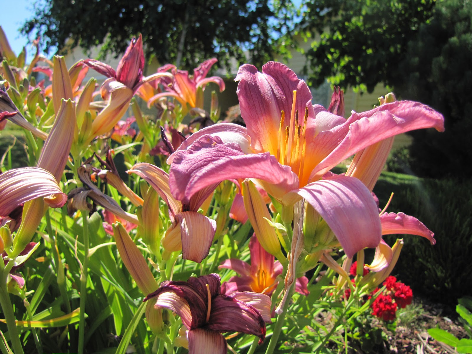
Starting a new painting. I've been wanting to do a big splashy floral for a long time. So I sifted through my folder of "To Do" photos and found this one I took last summer. I'm not sure the name of the flowers - does anyone know? But I love the color and splashy form, with bright sunlight and shadows. This should be a fun one! With my daughter's encouragement I decided to go for the largest canvas size I have on hand which is a 24" x 30". That's going to be a big flower! Not sure what I will do with the background, but I'll solve that challenge when I get to it :)
Here is the reference photo:


I put the photo on my computer screen in Photo shop Elements and used the crop tool to make a grid of thirds over the photo to help me with my placement. I sketched the same grid on the canvas.
Then sketched the major elements of the image. There is a house in the background which is creating some interesting directional lines that might be useful in the composition. On the other hand, I don't think there will be any question as to where the center of interest is! The challenge might be to move the eye to other parts of the painting as well. I might create a circular kind of pathway by adjusting and exaggerating the way the flower buds are pointing... Time to block in!
Here is where I'm starting today. Establishing my darkest darks. What looks like dark grey in the photo is really almost black, it's getting some glare from the window. I like the idea of very muted background colors to bring out the chromatic vibrancy of the flowers. We'll see how it goes!

Done with the block in. Pretty happy with it, but contemplating a couple of things. Do I like the background that dark? Do I want a petal to go off the edge on the right? Decisions, decisions!

Some work on the background and experimenting with taking a blossom off the right side. I can see from this view that the shape is almost even with the one going off the left - that won't work! I'll have to rethink that one :)


Worked on the main flower today. Tomorrow more of the loose stuff.

 Starting to develop the background flowers. Trying to stay loose and just get shapes of color.

As you can see I moved the petal on the left side lower so it wasn't on the same level as the ones on the right.  This is the fun part. a lot of squinting, matching colors and placing shapes of color. I'm thinking about the pathway the eye is taking and adjusting the position of the flowers and buds to revolves around the focal point. Trying also to keep to my original values.
I decided I didn't like the area on the right with the ground showing. It kind of distracted from the center of interest I thought. Brought back the dark area on the left center from my original value block in. Enough for today. Pretty happy with it, but I need to live with it for a day or so. What do you think?
A few finishing touches on the stem and bud area under the main flower, some tweaks to the darker flower on the bottom. I think that's it! Thanks for following! I'm calling it "Sunny Daylilly" it's 24"x30" and will be available in My Etsy Shop