by Karen Ilari
COLOR!
So now that you have a clear idea of what VALUES you want in different areas of your painting. Let's translate that into color.
First: Each color as it comes from the tube has it's own starting value.
For example Hansa Yellow Light is fairly light. Alizarin Crimson fairly dark
Second: You can make a color lighter by mixing with white - or with another light color. You can make a color darker by mixing with black or another dark color
Third: Light and dark colors - think sunlight and shadow - can be either "warm" (leaning toward reds, oranges, yellows) or "cool" (leaning toward blues, greens and purples). You can have a COOL yellow and a WARM yellow, for example.
Mixing Colors is a process. In acrylics you do a lot of
mixing as you paint, because the paint dries on the palette. You can't mix up
your whole color plan in advance. So, you start by asking yourself a series of
questions. What is the base color - the tube color nearest - Start with some of
that
- Is the
color more red?, more yellow? etc. keep mixing til you get the right color
- Is it
lighter? darker? Adjust for that
- Is it
greyer - more muted? Add the complimentary color to grey it
- Is it
warmer or cooler?
Exercise #1 Mixing Values in
Color
Supplies:
Heavy
Body Acrylic Paint: Mars Black and Titanium White, Ultramarine Blue, Pthalo Blue
(green shade), Alizarin
Crimson, Napthol Red Light, Quinacridone Magenta, Hansa Yellow Light, Hansa
Yellow Medium, Qunacridone
Nickel Azo Gold.
Flat synthetic brush - about 1/2"
wide
Water container, paper towels,
palette
Watercolor
paper
When mixing lighter colors with acrylics, it's especially important to realize that if you use just white, your color will get COOLER as well as lighter. This is seldom what we want in landscapes. Usually the sun has a warming effect, so when we want to paint an element in sunlight it needs to be lighter and WARMER
So let's practice and see how our colors work
with values
- Start with each of your
tube colors. Paint a square of it.
- Determine with your
value scale where the starting value is.
- Mix colors to match the
remaining values on the scale.
- Make one string for each
color using JUST WHITE to make the lighter values.
- Then make a string of
the same color using YELLOW or RED, along with white
It will look something like this:
Here I have used Napthol Red Light.
The top line using some Hansa Yellow Light as well as white.
Do you see how cool the lightest tone in the all white line is compared to the one with more yellow?
The Ultramarine Blue is similar - the all white is on the first line here. I've added a little Napthol Red on the second line.
Using Hansa Yellow Medium and Quinacridone Magenta would give different color tones. But you can wee the idea of WARMER and COOLER here.
What about going DARKER!?
The Darker colors above were Mixed by adding ind Some Alizarin Crimson, and some Ultramarine Blue to the Red as well.
You can use Mars Black or another tube black for mixing darker colors. But I find that tends to make duller, flatter colors.
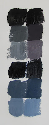
I prefer to use a mixture of these colors
for my black
Pthalo Blue - 1
part
Quinacridone
Gold- 2 parts
Alizarin Crimson
- 3 parts
This makes a very transparent rich black which mixes well with other colors. You can push it to be more Blue, Red, or Green by adjusting your amounts of each color.
Try mixing up this combination of colors, and compare it to Mars black on your watercolor paper.
Add some white to each one to see how that compares. As your mixture gets lighter it becomes more apparent what color you are leaning toward. If you want a more pure grey, you just mix in a little of the complimentary color. If it is too green add a bit more Alizarin Crimson for example.
Next mix each type of black with a tube color. Then add white.
Mars Black is on the left. The mixed black on the right.
Then adding white going down the page.
The lower set is each black mixed with Ultramarine Blue, and then white.
I find adding Mars Black deadens other colors in a mix. And what your really want to avoid is having dull darks. Especially in a landscape you want to keep your colors in the dark shadowed areas lively and interesting.
LAYERING
The technique I use most often in painting the landscape is Layering. What do I mean?
Simply developing the image by building up layers of paint. This gives you lots of room to refine your shapes and brushstrokes. Here's a detail from my painting "Saturday St Johns" to illustrate.
Notice especially the tree area:
- Start with your dark shadow values first - Add mid tones and highlights on top
- Start with thinner layers of paint, use more paint to make thicker layers as you layer
- The top brushstrokes are the thickest
- Keep the final brushstrokes spontaneous - don't over brush them
- If you don't like the brushstroke, shape or color - make another layer!
I use a small round bristle brush when making foliage. It is well worn and ragged. That's a good thing! It gives you natural random marks.
I use the brush mostly on its side, in rolling and tapping motions. Don't forget to soften the edges where you need to and leave some crisp.
You can watch me demonstrate layering techniques in this short video:
OKAY! Let's bring some color to our Painting!!
- Start in the back with the sky
- You already have your values
- Adjust your edges as you go
- Add your foreground details and brushstrokes last
Share your progress and join others learning to paint on my free website: www.paintwithkarenilari.com


