Wednesday, November 4, 2015

I'm Not a Creative Person


CREATIVITY.
 
I guess I'm just not a creative person.

I hear this too much. I've been thinking a lot about creativity lately and its power in our lives. And how to respond to that question.

Creativity being the ability to make new connections and combinations between ideas and things. And then to realize that new thought into reality.

Being creative is complex. It's a combination of knowledge and skill, freedom from limiting thought, and motivation from within.

Creativity takes effort.

SO WHY DO IT?

We need it.

Nothing in life can be stagnant without decay. A stagnant pond becomes unhealthy to drink and breeds disease bearing insects. Our bodies become weak and ill without use. Our minds become dull and forgetful.

If we aren't moving forward, we are moving backward. Though I love to think about just relaxing, not doing anything, retiring from the craziness that is life. I know that it is only possible for short periods of time. After that the decay sets in.

We need growth, and creativity. It heals us. It keeps us young.

The world needs it.

Without creativity, we can never find answers to the world's problems: war, hunger, misery, depression, homelessness, intolerance, hatred, etc, etc. 

All the easy solutions have been used up. We have new challenges to our planet, our societies. The easy way is to walk along the well worn paths. Not standing out, not swimming against the current. There's a quote from Henry Ford that sums it up: "If you always do what you've always done, you'll always get what you always got".

Everyday Creativity

Every day we have the opportunity for creative thought. My daughter wakes up every day, stands in front of her closet, and creates a new combination of clothes to wear. Sometimes they are, ummm, unusual! Sometimes they are brilliant! But they are creative. She has done an inventory of what she has to work with, where she needs to go, what she knows, and come up with a new combination, a creative thought. And with that warm up, she goes about her life with her mind already thinking along those lines. What if? Why not?

It is that process itself that we need. That surge of excitement. Engagement.

Creating new, more efficient systems. Finding a better bike route to work. Adapting a recipe. Resolving an argument. Hundreds of times a day we have the chance to do what has always been done, or find a better, more fulfilling, more elegant way.

Making creativity a state of mind, a habit, develops your ability to be creative when the big things come along. And gives you a boost of well being along the way.

Creativity and Painting

So this is why I paint, and especially why I teach painting. It is a path to developing and experiencing creativity. Which means it is a path to improving the quality of your life, and the lives of those around you.

Creativity is not for just a few. If you "can't draw a stick figure" that does not mean you aren't creative, or would not benefit from learning to paint. We are all creative. For all kinds of reasons, some of us have suppressed our creativity more than others. But we can change that, and enrich our lives on all levels because of it. Once you develop your creativity into a habit, it effects everything you do.

You are NEVER too old. Someone once told me she had given up painting when she hit 60 because she didn't want to be "an old lady who paints". Wow. It's better to just be an old lady?! Cause there's only one alternative to that! Whether or not you become the next Picasso, or turn your friends green with envy at your skill, is not the point. At all. The point is you living fully. Letting go of the boundaries and the barriers. Feeling that excitement and surge of growth.

Creativity takes effort.

You have to learn your stuff. When I was learning to paint, taking college classes, there was a real emphasis on "being creative". But I didn't have the skills to realize my creative ideas. It was very discouraging. You must develop your skills. Learn your theory. Composition, color, drawing and perspective. Practice your technique. Create that "muscle memory" in your hands so that you don't have to think about how or where to place your brush anymore. This is not an overnight endeavor! It truly is a life long one. To do this you need to paint, and paint a lot. And you need to read, study, be curious, visit exhibitions.

You have to give yourself permission to fail. It's not possible to be creative without taking risks. You must be willing to fail, and to keep failing. If you aren't, you will never try anything new for fear of ridicule from others, or from yourself! In reality it's often only you that cares whether or not you tried and failed, most people just aren't paying attention. In reality, the failure comes in not trying.

Free yourself from limiting thought. If you compare and limit your ideas to someone else's opinions; what your family, your social group, your peers think, you will never have an original thought. You must be willing to entertain all ideas, connections, concepts and not dismiss them because "it just isn't done".

You have to try. Creative thought is a choice. An activity. You have to be motivated to not just continue in the established pattern, but to experiment, visualize, focus. Put in the effort to activate your thought processes, and not just follow the beaten path. Not because someone else encourages you to, or you get positive feedback, but because you want to.

Is Painting Really Creative?!

Using our definition of painting: a putting together new connections, new ideas and realizing them. Is it really creative to sit in a class with me and paint the same painting as everyone else using the same materials?

The simple answer? No.

But you have to learn your stuff. You have to make the effort to learn the rules, so you can break them. Learn your technique so you can use it without thinking when you are excited by a new creative concept.

In my classes I try to take this complex, daunting activity of painting, and break it down, step by step. In my experience our minds tend to shut down and we lose interest when things seem so complex we don't even know where to start. In other words: if it's too hard, we give up. If we don't have immediate success, we give up. If someone else makes fun, or ignores our efforts, we give up. The only way to tackle this is step by step, in an environment that supports failure as the success that it is.

In the words of Vincent Van Gogh "If you hear a voice within you say ‘you cannot paint,’ then by all means paint and that voice will be silenced."

What I don't want is to create a formula for creating a painting that you just keep re-creating. Did you ever think about that word? It becomes (re)creation instead of creation. It's fun, it passes the time. That's not a bad thing! I do that kind of painting quite a bit! But what I'm trying to give you is a path to creativity. That healing, age defying, life changing, world changing experience.

So I don't make it easy. I keep giving you concepts and ideas to learn. When you ask me how to neutralize this blue I'm not going to tell you. I'm going to ask you what the compliment of blue is. When you have your value almost right I'm going to tell you that. It's almost right, try again. I'm not just going for good enough. NOT because I want you to paint a perfect picture. I want you to eng
age your mind. Activate your curiosity. It's this process that is the point. All these little discoveries about art, about your own abilities, that are the point.

If you think, "that's too hard for me to do". And then you let go of your fear, you think beyond your pre-set ideas. And then you try, and fail. And then you try again and make some connections - since that color combination didn't work, what if I try this one? And it works! That is the point. That feeling of opening up to the possibilities. Expanding your world. That is the point.

My goal is to help you develop the tools, create the environment, ask the questions. So you can expand your world through creativity. And by doing that, I expand mine!

There are lots of ways

Paths if you will. Paths that lead you to your own unbeaten path. Music, Painting, Dance, Writing, Sculpture - those are some of the more traditional ones. But you can practice your creativity in everything you do. In trying to be yourself, do it better, open your heart and mind to new possibilities. Work, home, relationships, neighborhoods, cities, countries, the world. The ultimate creative act is the creation of your own story. Your own life. Create it, develop it, live it, share it. You have the ultimate power of the universe within you.

So now, how do you neutralize that blue?

Sunday, September 13, 2015

Upcoming Events! Shows and Classes!

The First two weekends in October I will be participating in the Portland Open Studios Tour. 106 artists in the Portland area are opening their studios to show their work and their process. It's a really diverse and fun group. Paintings, Sculpture, Jewelry, Mixed Media, all kinds of visual excitement! Plus you get to see where they work, hear about their process and what their art means to them, and see how they do it!

There are 11 of us with studios in North Portland, and we have put together a "PDXOS Preview Show" opening Thursday the 17th at 6:00 PM. Revive - 2030 N. Willis - Portland through September 30th. Hope to see you there!


For more info on the Tour - click here


ALSO.....  New Class Starting!!!


Click here for more info on the class


Friday, August 28, 2015

How I photograph my Paintings...

Here is my unscientific, nontechnical, way to take photos of your acrylic paintings!

I've read about more technical ways, and I somehow still can't figure it all out! So over the years I've done lots of trial and error, and this is what I come up with... It's not perfect, but works well enough for my needs...

I use a fairly good camera, but not really pricey. Its a Canon PowerShot SX20. I liked it because it has a lot of zoom on it. You can do all the manual adjustments, but I don't know how and just use the auto setting.

So here is what I do:
  • Photograph before you put on any final glossy finish. Glare is a big problem to overcome with acrylics. Even outside in open shade a Charles mentioned, I get glare
  • No flash (just more glare, washed out color)
  • Use a tripod and the delayed setting on the camera. I use 10 second delay. Don't move a muscle until it goes off. This is important because I shoot in the lowest light I can to avoid glare, so you can't have any wiggle at all.
  • I set my painting on my easel - raise it up above the lip of the easel with  a piece of wood under the canvas. Set against an interior wall as straight up as I can without it falling over. Choose a wall that gets no direct light at all.
  • I just use my overhead daylight fluorescent lighting that is in my studio.
  • Place your tripod far enough away that you can zoom in just a bit - otherwise the edges of the canvas will look rounded. The whole setup is usually pretty low to the ground - this seems to help with light coming in from any windows.
  • Adjust the angle of the camera to get the sides as straight, and bottom and top of the canvas as horizontal as you can.
  • Put a piece of white paper behind the painting - but still in the frame so the camera can see it. This helps the camera with the color but it also helps later when you are adjusting in photoshop. You can use it to correct the "color cast"
  • Use your 10 second delay and shoot!
I know this is a total workaround. But I am the workaround queen. :)
The adjusting I need to do in Photoshop elements is usually just to:
  • increase the contrast
  • correct the color cast - using the white paper as the spot to click on. Some area of the white will usually bring the colors close to the original
That's usually all I have to do to be pretty close!

Thursday, August 20, 2015

Learn about Values! Step by Step! Class #3

The Magic of Values in the Acrylic Landscape. Class #3
by Karen Ilari 


COLOR!
So now that you have a clear idea of what VALUES you want in different areas of your painting. Let's translate that into color.

First: Each color as it comes from the tube has it's own starting value.
For example Hansa Yellow Light is fairly light. Alizarin Crimson fairly dark

Second: You can make a color lighter by mixing with white - or with another light color. You can make a color darker by mixing with black or another dark color

Third: Light and dark colors - think sunlight and shadow - can be either "warm" (leaning toward reds, oranges, yellows) or "cool" (leaning toward blues, greens and purples). You can have a COOL yellow and a WARM yellow, for example.


Mixing Colors is a process. In acrylics you do a lot of mixing as you paint, because the paint dries on the palette. You can't mix up your whole color plan in advance. So, you start by asking yourself a series of questions. What is the base color - the tube color nearest - Start with some of that
  • Is the color more red?, more yellow? etc. keep mixing til you get the right color
  • Is it lighter? darker? Adjust for that
  • Is it greyer - more muted? Add the complimentary color to grey it
  • Is it warmer or cooler?
Exercise #1 Mixing Values in Color
Supplies:
            Heavy Body Acrylic Paint: Mars Black and Titanium White, Ultramarine Blue, Pthalo Blue (green shade), Alizarin Crimson, Napthol Red Light, Quinacridone Magenta, Hansa Yellow Light, Hansa Yellow Medium, Qunacridone Nickel Azo Gold.  
            Flat synthetic brush - about 1/2" wide
            Water container, paper towels, palette
            Watercolor paper        


When mixing lighter colors with acrylics, it's especially important to realize that if you use just white, your color will get COOLER as well as lighter. This is seldom what we want in landscapes. Usually the sun has a warming effect, so when we want to paint an element in sunlight it needs to be lighter and WARMER   

So let's practice and see how our colors work with values

  • Start with each of your tube colors. Paint a square of it.
  • Determine with your value scale where the starting value is.
  • Mix colors to match the remaining values on the scale. 
  • Make one string for each color using JUST WHITE to make the lighter values. 
  • Then make a string of the same color using YELLOW or RED, along with white 
 It will look something like this:
Here I have used Napthol Red Light.
The top line using some Hansa Yellow Light as well as white.
Do you see how cool the lightest tone in the all white line is compared to the one with more yellow?

The Ultramarine Blue is similar - the all white is on the first line here. I've added a little Napthol Red on the second line.

Using Hansa Yellow Medium and Quinacridone Magenta would give different color tones. But you can wee the idea of WARMER and COOLER here.

What about going DARKER!?
The Darker colors above were Mixed by adding ind Some Alizarin Crimson, and some Ultramarine Blue to the Red as well.
You can use Mars Black or another tube black for mixing darker colors. But I find that tends to make duller, flatter colors.


 I prefer to use a mixture of these colors for my black
Pthalo Blue - 1 part
Quinacridone Gold- 2 parts
Alizarin Crimson - 3 parts

This makes a very transparent rich black which mixes well with other colors. You can push it to be more Blue, Red, or Green by adjusting your amounts of each color.
Try mixing up this combination of colors, and compare it to Mars black on your watercolor paper.
Add some white to each one to see how that compares. As your mixture gets lighter it becomes more apparent what color you are leaning toward. If you want a more pure grey, you just mix in a little of the complimentary color. If it is too green add a bit more Alizarin Crimson for example.
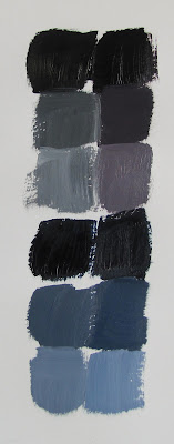
Next mix each type of black with a tube color. Then add white.
 
 Mars Black is on the left. The mixed black on the right. 
Then adding white going down the page.
The lower set is each black mixed with Ultramarine Blue, and then white. 
I find adding Mars Black deadens other colors in a mix. And what your really want to avoid is having dull darks. Especially in a landscape you want to keep your colors in the dark shadowed areas lively and interesting.
LAYERING
The technique I use most often in painting the landscape is Layering. What do I mean?
Simply developing the image by building up layers of paint. This gives you lots of room to refine your shapes and brushstrokes. Here's a detail from my painting "Saturday St Johns" to illustrate.
Notice especially the tree area:
  • Start with your dark shadow values first - Add mid tones and highlights on top
  • Start with thinner layers of paint, use more paint to make thicker layers as you layer
  • The top brushstrokes are the thickest
  • Keep the final brushstrokes spontaneous - don't over brush them
  • If you don't like the brushstroke, shape or color - make another layer!
I use a small round bristle brush when making foliage. It is well worn and ragged. That's a good thing! It gives you natural random marks.
I use the brush mostly on its side, in rolling and tapping motions. Don't forget to soften the edges where you need to and leave some crisp.
You can watch me demonstrate layering techniques in this short video:
OKAY! Let's bring some color to our Painting!! 
  • Start in the back with the sky
  • You already have your values 
  • Adjust your edges as you go
  • Add your foreground details and brushstrokes last 
Share your progress and join others learning to paint on my free website: www.paintwithkarenilari.com
 

Thursday, August 13, 2015

Learn about Values! Step by Step! Class #2

The Magic of Values in the Acrylic Landscape. Class #2
by Karen Ilari 


Develop your 5 Value Block In to Full Value


After our last class, we now have our large shapes of solid value in the right locations on our canvas. Yours should look something like this:

Now we want to further develop this sketch. How do I do that?!
Keep these things in mind:
  • All you need to do is break the LARGE shapes into SMALLER shapes.
  • Maintain the same overall VALUE in the area.
  • Just refine the shapes to more accurately match your reference. 
  • Think about SIZE, SHAPE, and PLACEMENT of each spot of value
  • Still using the same 1/2" flat brush.
  • Don't think about DETAIL, just breaking down the large shapes into smaller ones.
  •  Pay attention to the EDGES of your shapes. Should they be soft and blended or hard and crisp?
  • Take your time. Study what you really see in your reference. Don't assume anything. Really look at what is there paint it the way you see it.
This is how you TRAIN YOUR EYE to focus on value. It takes practice. Just knowing what you should do is no substitute for picking up your brush and laying down the paint. You need to develop those pathways from your eye to your mind to your hand until it feels like the mind is no longer even involved. Straight from your eye to your hand. It becomes automatic. But ONLY after you spend the time practicing your craft!

EDGES           
What does that mean?
Instead of thinking about the image you are painting as THINGS - trees, bushes, flowers. I want you to think of them as SHAPES with a certain VALUE, COLOR, EDGE, SIZE and PLACEMENT.

We've been learning about Value, and the others are pretty easy to understand. But what do I mean by EDGES? Let's take a minute to talk about this some more: Here is a close up from our reference photo:
Now. SQUINT YOUR EYES as you look at this.
Do you see the hard edge between the tree trunk and the background field? You can clearly SEE the edge. It is crisp and distinct.
Look at the foliage in the tree. Do you see how these edges are less distinct - the blend together more.
Look at the edges of the shadow of the trunk lying on the ground. Do you see how the edges of this shape are softer? Compare that edge to the bottom edge of the trunk just above it
Here is another example:
Look at the edges of the shapes in the background mountain. They are soft and blended. Do you see as you come forward in space, your edges become more distinct, but not as sharp as the edges in our foreground.

Now. That is what we see in our reference photo. 
Now we have to USE this reference and EDIT it to tell OUR STORY. 
Edges can be a powerful tool to:
  • create emphasis in your focal point with crisp, distinct edges
  • lead the eye through your painting with strategically placed crisp edges
  • de-emphasize a less important area by softening the edges
  • create a stronger sense of distance by softening edges even more than you see
  • Create subtle gradations of value and color by softening the edges between the shapes
  • describe the texture of an object- how hard or soft it is. Hard objects create crisper edges
So you can have a strong change in VALUE from one shape to the next. But you will get a different effect depending on whether that shape has a SOFT EDGE or a :HARD EDGE. 

Exercise #1
EDGES
Supplies: Mars Black and Titanium White Heavy Body Acrylic Paint.
                flat synthetic brush - about 1/2" wide
                water container, paper towels, palette
                watercolor paper                   

How do I do get a soft edge with Acrylics?
Using your watercolor paper, and your black and white paint. Let's practice some edges
The key to soft or blended edges in acrylics is understanding how much wet time you have before the paint dries. This is something you will get a feel for the more you paint. 
In general: 
  • Work Quickly, in small areas
  • For Larger areas - like a sky - Use larger brushes.
  • Lay down a shape, adjust the edges right away.
  • Be sure to work over at least one layer of paint - your block in
  • Use a good quantity of paint
  • Rinse your brush often 
  • Use a light touch
  • Adjust the wetness of your brush with a paper towel
So on your paper. Make some rectangles of different shapes like this. Let them dry. 
Now lets make some blended edges between these. There are three  ways:
One Value (or color)
1.  Lay down a shape of just one value - blend the edge RIGHT AWAY 
2.  Rinse your brush thoroughly. Blot on a paper towel.
3.  Use a scrubbing motion from the dry side into the wet side to soften the edge

 Two Values (or colors)
1.  Mix up the two values that you want to blend
2.  Paint in your two shapes. If the shapes are large, just do a smaller section at a time.
2.  QUICKLY rinse your brush and blot it to damp.
3. Use a sweeping motion to blend the still wet patches

Three Values (or colors) 
1. Mix up a shade between the two values you are trying to blend
2. Lay it down on the blending area
3. Rinse your brush thoroughly. Blot to damp. 
4. Use the scrubbing motion as before to blend each side of the new patch.

In all methods. Finish off by cleaning your brush thoroughly, blotting to damp, and very lightly sweeping across the area to blend. Wiping often on a towel to remove excess paint picked up.

Click here for a short video demo of blending edges
 
So now let's practice those different edges as we finish our full value block in of our painting
 When you are done, you should have something like this:
  You may notice that I've made further refinements to my 5 value block in:
  • The field behind the tree is lighter to add more contrast to the dark tree form and draw more attention to my focal point.
  • The shape of the tree and shadow have been developed and refined.
  • The value shift between the field and wildflowers have been blended and minimized.
These are the kind of changes you make as you spend more time with your reference, and with the way the image is developing on the canvas. You are adding your own interpretation. What feels and looks right to you. Everyone see and paints differently. You can't help your own individual style coming through. It's not something you decide on or make up. It's just what happens after you paint for a while.

Click Here for Lesson #3- How do we translate this to COLOR?!

And please feel free to share your progress and comments!

Saturday, August 8, 2015

Learn about Values! Step by Step! Class #1


The Magic of Values in the Acrylic Landscape
Class #1
by Karen Ilari

Join me in this step by step class - learn to see and match values. 

First let's talk about values, what they are and how they help make better paintings...
There is a lot to think about when you are painting. And a lot to learn! Let's start with this - there are four main concepts to master in painting:

  • Values
  • Drawing
  • Edges
  • Color

The first and most important, especially for landscape painting, is VALUE
It is also the area that most painters struggle with, especially at the beginning.

What is Value? Simply how light or dark something is.

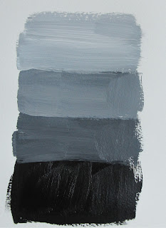
To illustrate, we use a Value Scale. This is a gradation of 9 values from Black to White


You can hold it up against your work and your reference to compare.

The challenge is to train your eye to see value, whether in a reference photo or in real life. Our natural tendency is to see color and form over value. We will notice first that something is red, or blue and paint it that way. Or that is an object we recognize, and what shape it is. You have to learn to stop and REALLY SEE WHAT IS THERE! In reality red in light and shadow are very different in value and color. In fact black in light can be lighter than pink or yellow in shadow. Sometimes an object and its background will be the same value! Creating lost edges - where you can't see where one thing stops and the next starts.

As an example, let's take a look at this painting of mine "In the Morning Light" :


You can see that his dark grey T shirt in sunlight is a lighter value than the light brown  and white of the sign in shadow, or the white lettering on the awning in shadow.

So we have to learn to see the values first, before color, and then to match them. 

EXERCISE #1
Supplies: Mars Black and Titanium White Heavy Body Acrylic Paint.
                watercolor paper
                flat synthetic brush - about 1/2" wide
                water container, paper towels, palette
Copy the value scale above and print it out. Preferable on photo paper. 
Now match these values and paint your own 9 value scale! Easy! You might be surprised!
This gives you practice in focusing on seeing and matching a value. And if you are new to acrylics, some time to get used to how they feel. Don't use any mediums, just paint and water. Keep the paint thick and try to create thoroughly mixed squares of even value. You can punch a small hole through the middle of each value on your printed scale. This way you can hold it right on top of your work to isolate the value and see if you have a match.
And remember - ACRYLICS DRY DARKER! So don't be surprised if your perfect wet value is too dark when it dries! This is just something you learn to compensate for in painting with acrylics, so this exercise is good practice for that too!

Okay, Now that you have done that.... 

What do Values do for us? 

  • Distance - as things recede into the distance, they get lighter. They also lose some of the contrast. In other words - the lights get darker, the darks get lighter. The value range is higher on the value scale and closer together.
 Here is another of my paintings to illustrate - "Summer Pond"

Take a look at the trees - compare the value on the sunlit side and shadow side of the tree in the foreground and those in the middle and background. Do you see how the lights get darker and the darks lighter progressively as you move back in space? This - along with size, color and detail, creates the illusion of distance.


  • Light - the contrast from sunlight to shade. A sunny day will have strong value contrasts. An overcast day will have values that are darker and with less contrast - closer on the value scale. In fact you can "push" the values - make the lights lighter and the darks darker - in your reference to create a more sunny day! Magic!

  •  Form -  In a dark room you can't see form at all. It is the light as it strikes the surfaces of an object that describe its shape to us. On the other extreme a very bright light setting, with light hitting all the surfaces, will wash out an object so we can't see its form. Correct placement of values on an object are key to it looking real.

  •  Composition - The patterns formed by light and dark in a painting are key not only to realism, but to its visual impact. We draw the eye and lead it around our painting by using contrast. Reducing your image to a simple design of 3 or 5 values will reveal its essence. The abstract pattern that is at the core. Once reduced in this way you can manipulate the forms to best tell your story.

So - now let's do a little painting - and practice seeing and matching values some more:
Exercise #2 
Supplies: Same as exercise #1, but this time use a 9" x 12" stretched canvas or canvas panel.  

Step One: Choose a photo
We start with a simple reference photo like this one. I chose this for it's simple large shapes, forms progressing into the distance and the obvious effects of light and shadow.

I've already cropped it to the size and placement I wanted - 12" wide by 9" tall. I've even added some to the left hand side in photoshop because I wanted my tree to be about a third of the way from the side. These are compositional ideas that we will talk more about in another lesson. I used the "Rule of Thirds" which means dividing your canvas into a tic-tac-toe and then putting main elements on the intersections of the lines, and main divisions - like the horizon or edge of the field on the thirds.


Step Two: Change your photo to Black and White:
You can use any photo program to change your color photo reference to a black and white version. I use Photo Shop Elements. Then choose Enhance -> Adjust Color -> Remove Color.


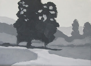
Step Three: Paint your image with only 5 Values
The key tool for seeing values is to squint your eyes - or blur them - soften your focus.  
The idea is to make a decision in each area as to which of your five values its closest to and then simplify the forms, removing the detail. Keep your forms simple - big geometric shapes with no detail at all. Mix your color on your palette so you get a nice even tone. Clearly defining the value of each shape. You will end up with something like this:


It looks simple but it isn't! Don't be discouraged if this takes you a long time! I find I have to keep stepping back and reminding myself to look at the LARGE shapes, not the details! Though there are lighter and darker areas in each shape, you want to look for the overall value you see when you squint your eyes. Remember - NO DETAIL - LARGE SHAPES - SOLID EVEN TONES

But that doesn't look real! You're right! We are starting at the most basic building blocks. The foundation for our painting. We are using our creativity to tell the story from our own unique perspective. Once you have blocked in what you see, Ask yourself some questions...

How Can I Improve this Image?
Are there areas that are confusing in the photo? Not enough value shift to really see the distance? CHANGE THEM! At this point you can clearly see those shapes. are they working?  Use your artistic license and tell your own story.

Do the forms create an interesting, appealing pattern?
  • Avoid half dark, half light. Thirds are always nice. I've chosen about 1/3 dark, with the rest medium or light
  • Is the focal point shape clear and placed in the best spot? The large tree is our focal point.
  • Use big shapes, connect your shapes, avoid polka dots - isolated spots
  • Look at the form shapes - are they appealing? I changed my tree shape so it wasn't quite so square, and had branches come down to connect with the shadow.
Are you Leading the Eye?
  • Provide an entrance into your painting. Here I've altered and emphasized the area of light wildflowers in the photo to use it as a path for the viewer to follow into the painting.
  • Define your focal point. The area with the highest contrast will draw the eye first. I have chosen the tree as my focal point and am using the light value and form of the fallen log, the light value of the flowers, the spots of sky peaking through and darkening the value of the tree itself to really define it as the center of interest. It is the area with the darkest darks and lightest lights
  • Create movement and rhythm. Once you have led the eye in and to your focal point, be aware of the lines that the eye will follow next. Don't have lines that lead them directly out of your painting. In mine the eye will go from the tree to the mid ground trees whose shape leads the eye up and around in circular motions that bring it back to the foreground.
  • Leading Lines. The large shapes in your painting will create lines. Be sure they are supporting your focal point, and not leading the eye out of the picture.
Here you can see the lines that invite the viewer in and to the focal point, then around and back in. Without the forms of the mid ground trees "stopping" the eye, it would just travel right out of your painting. You want to keep your viewer engaged and directed back into your painting.

 You can also see how all the other lines formed by the shapes lead to the focal point.

WOW! That's a lot to think about for this simple little design!
Yes! It is!
But remember, this is your foundation! There is a lot of design and planning that goes into this stage. Each step builds on the next. If your foundation is strong, your painting will be strong. It will catch the viewer's eye from across the room and draw them right in.

Remember, as you train your eye and hand, this stage will take less and less time. In time you will not need to physically go through this step, but will visualize it in your mind before you start.

And you will be soooo happy when this concept falls into place. Your paintings will take a huge leap!

Exercise # 3
Find some images to practice with. Magazines, online, any will do. Look for the elements described above. Distance, Simple shapes, clear light and shadow.


Use your 5 values of paint on some watercolor paper

Paint a bunch of small 5 value studies of these images. Just 3" x 4" or so.

 Remember: 
       No detail

 Large shapes

 Define the focal point

 Show the distance

Create appealing design


Click here to go on to Class #2!

And don't forget to share your progress in the comments....