Thursday, December 12, 2013


Happy Holidays Everyone! I'm running a drawing on my Facebook Page - you can get a
 free pet portrait
 painted by me if you share the link for my pet portraits on your facebook page!
here is the link to get there Facebook drawing!

 Here's a pet portrait I did of my grandpuppy Jackaroo! I really enjoy painting animals, they have such sweet expressions. I painted this one as an example of a custom pet portrait.
 and the photo I used...
I'm selling gift certificates for these portraits in my Etsy shop. Click here if you are interested.
I think it's a great gift idea for that pet lover on your list :)

Sunday, October 6, 2013

"Autumn Forest" - Painting with saturated color in nature

Well my challenge for myself is a large 18x24 painting with fall leaves as the main subject. I took a series of photos last fall of  brilliant yellow leaved trees in a country setting. None of the photos is just what I am looking for composition wise. In fact this one is more experimental than I usually do. I've never been completely happy with my fall paintings. When I'm out there I have a feeling of being surrounded by color, as if I am breathing color. The yellow gold atmosphere I felt under these trees was really magical. There was sunlight, but it was soft, and the air was cool and crisp and fall like. I want to somehow create that feeling, of breathing the color. Feeling the soft golden shades on my skin.
Here are the reference photos:
 I decided to use the mossy tree trunks in this first photo, and the nice foreground fallen leaves. I also like the close up leaves and the transition from the small leaves further back to the larger ones in front.
 I like the softly lit background field in this one, and the small trees on the left.
 I like the directional branches going from right to left in this one, and more beautiful leaves close up. Just still not sure how to compose. This one has a very angular composition. Hmmmm
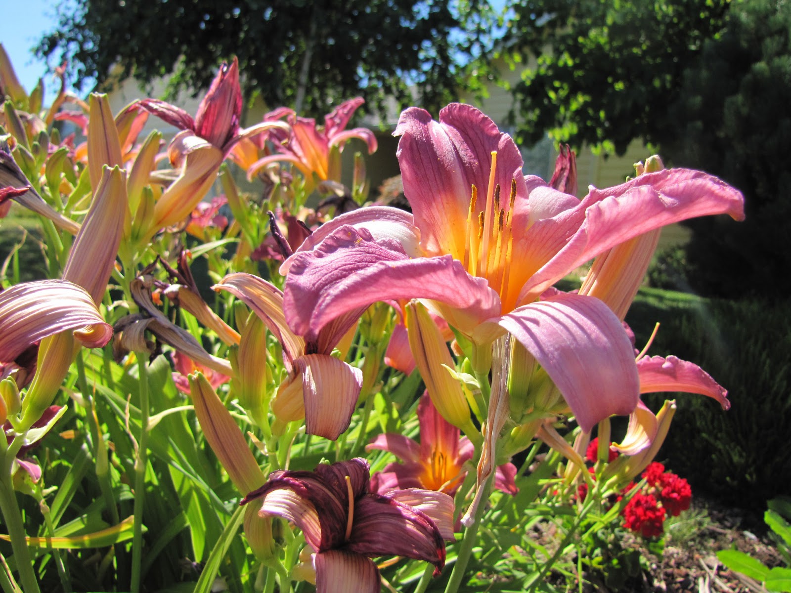
This one shows more of the background trees. The barn is nice, but it's not my focal point so I don't think I will use it in this one. The warmth in the leaves is giving me more of the feeling I remember from the day. It's amazing to me how photos can't capture that feeling! So that's my challenge!
Here is my block in stage - with work done on the background
I expanded on the background hills to get more cool colors which should help the golden leaves pop more. I want the background to just give a sense of space and softness. Once I put that center tree in I realized to was smack dab in the middle! Arg. I ended up just taking it out as that whole area needs to stay very quiet and will be largely covered up. I used purply colors for the block in, hoping again that the complimentary color will help my golden leaves glow. Playing with the idea of a path as a lead in, we will see where that goes!


At this point I got rid of the green in the field. it was too much color and seemed to be making a different statement than fall leaves to me. experimenting with the composition and laying in tree trunks. Having fun creating the layered texture of the tree trunks and the ground. Using a lot of alizarin crimson and quin gold.

adding fallen leaves to the ground. starting with darker mixtures of alizarin crimson, quin gold, cadmium red greyed down with Ultramarine blue. then less blue for the brighter leaves. I'm using single brushstrokes with a soft edge and a hard edge to define shapes. Not drawing them. I started with greys to create some some background foliage. My thought being that will help the brighter colors pop. Trying to keep my shapes smaller in the back, with larger leaves as I move forward. Stopping here for a couple of days as I'm not completely happy with the composition. The two tree trunks are too similar in size and placement. And I know I want some closer leaves but again am not sure on the composition... I am liking the warmer golden color. The yellow in the photos is just so much cooler than I remember from that day.
well, a very experimental day! At a certain point, when I feel like I'm not achieving what I'm going for I have to get myself to step back. Relax and realize it's all just an experiment! I'm trying to find that line between realistic leaves and blobs of paint. I think I made some progress, but not there yet. I did decide on a kind of spiral composition. Maybe it will give that feel of the swirling leaves as they fall. I thinned out the left hand tree a bit and brought it forward.. I'll give it a rest for a day now and come back. There is kind of a cartoon feel to it still I think. Maybe those saturated colors. But those colors are the whole point of the painting! Haha, I love this little journey I go on in each painting. :)

Sooo. Back from the "day job" yesterday. Can't say I am even a little bit happy with this painting at this point. I did a google search for autumn leaves acrylic paintings. No help. Pretty much people do close up leaves or distant leaf blobs. But this painting has been in my head a long time and I need to come to some sort of peace with it. Ugh. I'm feeling actually physically ill which is how I get when I can't resolve a painting. I'm hoping it's because I'm nearing a breakthrough! Hoping, hoping, hoping!

Well, let me articulate what I don't like if I can. The big leaves look sooo heavy and dense, like they are made of clay! I got tired toward the end and especially the bright yellow brushmarks are mushy and not courageous. The spiral theme feels gimmicky. I love the reds on the ground - the ground looks bluer here than it is. But, is the ground lava?! (a game my kids used to play). This doesn't feel cool and crisp like a fall day. It feels hot. I had gone through a phase where the big leaves were more realistic. But they just looked overworked (and still do)

Okay, what is the breakthrough? Let's try some specific changes. I need more air/background in the big leaves. Less dense. I need a gradation of color from big leaves on right to smaller on left. They are all the same. Need to lose the 3 big same shaped leaves - vary the size and orientation of the leaves. I need more neutral colors in the leaves. Just too much saturated color. And some lighter yellow, maybe cooler yellow. Do I need some dappled sunlight catching a bit of leaves and ground? Maybe use sunlight as part of the spiral instead of all saturated color? Edges. I need some crisp edges in the big leaves. just a few and the rest much softer and more lost.
 So, lets give that a try. Chime in here any time! I can use all the help I can get :)

Okay, todays progress

some things are better. Big leaves are okay. dappled light not so much. too much I think and too cool. Not to happy with the dull gray flat spots upper right. light on tree trunks not convincing. left tree trunk not good, also dont like the curved smaller branch on the left


Well, aside from the fact that I can never seem to photograph the color right. This one is actually truer to the  real colorsm but there is more green in the dark areas of the leaves. oh well. Dappled light better I think, and tree trunks. It may be done. I think I made some forward progress. It feels kind of fantasy like to me. Like there should be a troll peaking out of the trees hmmmm

okay, final final....

"Autumn Forest" 18x24 acrylic on canvas. Original available in my etsy shop
Happy painting!

Thursday, September 26, 2013

"Summer Pond" An Acrylic Landscape Painting Tutorial Video

Just finished up another tutorial video. I may have mentioned before, but I have an art instruction website Paint With Karen Ilari It's a free site, you just have to register. I started it a while back as a way to connect with people out there who want to learn to paint, or switch to acrylics from another medium. It's been so much fun! I really love painting with acrylics. They are the non stress medium to me. You don't have to worry that one stroke will ruin your painting (watercolors) because it will be dry in a minute and you can come back in and try again. No toxic fumes. My studio is a room in my house and I am super sensitive to smells, so oil painting is out for me. Clean up is easy - I'm a messy painter - just water and a little soap. No long drying times when pets or little hands can get in trouble! Yep, I do love acrylics. But back to the website. I have over 100 members at this point from all over the world. They post their paintings to share, and if they want I will give them a detailed constructive critique. I'm having a lot of fun with it, and I feel like I'm helping people who are in the same place I was a while back. Art opened up such a rich new world for me, and I love it when someone else discovers it as well!
Sooo, in this new video, I paint "Summer Pond" here is the finished painting: and the link to the classroom page on my website

"Summer Pond" 9x12 Acrylic on Canvas
original available in my Etsy shop here

So if you always wanted to learn to paint, or can't seem to get back into it, please join me on my website Paint With Karen Ilari

Happy Painting!
Karen

Tuesday, September 24, 2013

Girl's Painting Weekend on Mt. Hood

Well last weekend I spent a lovely weekend with my good friends Vinita Pappas and Debi Bates. Both wonderful artists. We stayed at a sweet vacation house on the Zig Zag river, a really beautiful location. We thought we would paint all weekend, but mother nature decided to give us rain and overcast instead! Ha! Well, we had fun drinking wine and beer and soaking in the hot tub, so it was well worth it! Here are a few photos from the trip:

This is Trillium Lake. We hiked aaaalll the way around it! :) I hear if its not windy Mt Hood is reflected in it beautifully. It was sunny that day, but there were a lot of people there and we didn't quite have the nerve to set up and paint!

The next day looked like this! This is the Sandy River, and boy is it! Vinita had our hikes and events all scheduled :) We considered packing our painting gear in on this hike, but since it said it was 7 miles with a lot of uphill we thought better. We thought we were lost a couple of times, but I wasn't leading, so we were safe. Instead we just hiked, and hiked, and hiked! But it was awesome and we were headed for Ramona Falls, isn't it beautiful!

just amazing colors and rocks. The photo doesn't do it justice. And there was this craggy ancient looking face in part of the rocks. I'd had a dream the night before and saw a face really similar. I think it was the spirit of the falls! ;)
Anyway, lots of calories burned, yea! More room for beer! I'm not going to whine, but my feet were hurting by the time we got back! Yea hot tub!
The final day we thought we would drive to Timberline lodge for the view, and maybe paint? Well, by the time we got to the top it was 42 degrees and drizzly almost snowing! We knew Mt. Hood was RIGHT THERE but we couldn't see a bit of it. Oh well. We drove back down and had to find something to paint! We ended up at Little Zig Zag falls. An easy sweet little hike. Here's the top of the falls

 It was pretty wet and cold, so we set up a bit further downstream.

So, as you know, I paint in regular acrylic paints. It was soooo wet, actually raining that the paint just would not dry. I thought I was painting with oils (horrors! :) And Vinita and Debi were using watercolors! Ha. Well, my hope was to try to get a sense of these deep rich greens. So here is the little 9x12 I did that day. And by the way, I was trying to lighten my pack and not use my relatively heavy wood Guerilla Painter box. So Vinita came up with the bright idea of using the plastic container her to go sandwich came in! It actually worked really well! I put a layer of wet paper towel and some disposable palette paper, and squeezed out just enough for a painting (okay I put too much, over prepared as usual!)  Then I just set my "palette" on my lap and held my canvas in one hand and my brush in the other, sitting on my little foldable tripod camp stool. Worked great, and very light! sorry no pics. But here is the little painting.
Now, not being a Plein Air Purist, you know I'm not going to leave it that way! :) Stay tuned to see if I ruin it or improve it. You be the judge!

Okay, here is the "after" version. What do you think? An improvement?
Okay, one last "final version. I wasn't happy with the geometrical triangle rocks in the frot... and some unfinished area on the left.


Sunday, September 8, 2013

Light through the leaves

I have a never ending Fascination with light filtering through trees. Here is yet another attempt :) It is 18" x 24" acrylic on canvas
Click here to see a larger version

There is a basic problem with trying to paint light with pigment. In real life you can have very light AND very colorful. In pigments, you add white to go lighter, which makes the color less saturated, less intense. It's a fun challenge!
Some things I do to try:
Value Contrast - You can only go so light, so you have to go darker with the things around the light to make it seem brighter.
Temperature Contrast-Usually you will want the light to be warm, except moonlight! But I haven't tried that yet :) To warm up a very light color, it seems to help to put cool colors around it. The contrast makes the light seem warmer.
Saturated color - It also seems to work to put spots of very saturated color around the light, here I use orange on the tree trucks and some neon greens in the leaves
Transitions - You can see the splashes of sunlight on the forest floor because you can see the same plant in both shadow and light.

Anyway, just some things I have come up with - what works for you in painting light? I'd love to hear!

Thursday, September 5, 2013

Pacific Northwest Plein Air Event

Just returned from 4 lovely days spent painting around Hood River, Oregon along the Columbia Gorge. It is considered the "Windsurfing Capital of the World". Which makes keeping ones easel upright challenging at times! It wasn't too bad, really, the weather was warm and sunny. I met some amazing artists and really enjoyed it. We could turn in up to 5 paintings, I don't know which, if any they are going to hang for the show - but here they are for your enjoyment. Do you have a favorite?

These are from day one at the Gorge White House, a great old house surrounded by U-Pick flowers and fruits.

"U-Pick Beauty" 9"x12" acrylic on canvas

and "Hillside Farm" 9"x12" acrylic on canvas
The second day we were at a private residence with stunning views of Mt. Hood and horses that just wondered around the yard like pets :)
"Field With a View" 9"x12" acrylic on canvas.
I did another that day of a creek running through the property, but I need to do some more work on that one. Also I ended up with 7 paintings and had to trim that to 5. I'll post it later though after it gets a tune up :)
The third day we were at a winery, also with stunning views of the river from way up high. There were a bunch of us all lined up along the road painting, quite the sight! The morning light was soooo bright on the water, I had to squint my eyes and not look at it for long. Even so, my eyes were very tired that night!
"Morning Light" 9"x12" acrylic on canvas
I did another that day as well, later in the day when the water was all blue grey, it also needs a few tweaks :)
The forth day we wen to Mayer Park. There were wonderful shadows on high cliffs all along the river. I decided to give my eyes a break from looking at the bright reflections and painted toward the hills instead. I was standing under a tree near a spot where windsurfers take off, so no umbrella that day for shade!
"Shadow Play" 9"x12" acrylic on canvas.
I was going to do a second that day, but I admit I was pooped! Tired but happy. I went home to the house my good friends Greg and Laura let me borrow and slipped in the hot tub with a cold beer. Ahhhh. Good times :) Hope I get invited back next year!


Sunday, August 25, 2013

Some Plein Air Pieces

I finally got to go out and do some plein air painting this week! Plein Air - meaning outdoors on location - has become quite popular in the last few years. For me it has been an excellent way to train my eye and hone my skills. You have to paint quickly as the light changes fast. It also helps you learn to edit, edit, edit. Find a composition quickly, and ignore all the extra detail that doesn't tell the story. When I'm out I also take lots of photos. From these and the pieces I paint out there I can make bigger studio pieces. The photos help me capture a moment and fine tune the drawing, but its the color where photos really fall flat. The detail in the shadows disappears, the colors get simplified and blued. And then there is that subjective aspect. Standing in a location for a few hours you get the feel, the smell, the sounds. All that becomes a memory and back in the studio you can relive those feelings as you paint. And if you keep the painting, every time you look at it you are transported back to that place and time. It's a great thing!
So here are the two I did this week... Next weekend I will be spending 5 days painting in the Columbia Gorge! Can't wait! Now if I can just get over this summer cold :/

Calling this one "Shades of Summer" It is 9"x12" acrylic on canvas. The cut fields were such a rich golden color and the corn tall and ripe. This is Sauvie Island just to the north of Portland. Somehow the color just feels extra vivid out here. A lovely place to paint!

 Also done on Sauvie Island, a couple of days later. I was really feeling the clouds that day and wanted to spend some time trying to capture them. The whites of the clouds are actually yellowy goldener than this photo. It strikes me that when you paint from a photo you not only lose color subtlety in the reference, but also again when you photograph the painting! The sun was peeking through the clouds and lighting up different spots. I chose the time it lit up the bank of trees on the left. Painting clouds is a bit like herding cats! Talk about changing quickly! But still fun.

Sunday, August 4, 2013

Reflecting

I'm working on another video this week, thought I would share some snapshots from my progress. I make these videos for my free teaching website: www.PaintWithKarenIlari.com It's my attempt to encourage other painters, from very beginners, to paint! I post teaching videos, and we have forums where you can post your own paintings for helpful ideas from myself and others. I love the world wide scope of it. We have regular posters from Ireland, Australia, Newfoundland Canada and all over the states.
Videotaping brings its own challenges - and I'm learning as I go! Finding a camera angle that gets the painting, the palette, but not me! is a challenge. In this one I'm trying a new angle that I think is working pretty well. I also have to work fairly small for it to work. This painting is an 11"x14"

These are snapshots taken from the video:
Here is the block in stage:

It is a scene of a sunlit bank of the river, reflecting into the river, with shadowed foreground trees.

At this point I am done with the far bank of trees:


And now with the river and little islets in the river


 And starting the trees and foliage in the foreground - interesting how the lighting in the video changes as the light outside does, it got much cooler here. It was more overcast outside. I have south facing windows in my studio, not the best, but at least the sun doesn't shine straight in at any point.


And adding more foliage:

This is the point where I let it sit and then decide what to change.
1. I wish I hadn't put so much foliage in, I covered up too much of the background. I'm going to go back in and recover some of it.
2. The value of the foreground foliage is too close to the shaded Islets in the river. I think I will lighten them up a bit to get some distance.
3. There is a lot of the canvas texture showing in the foreground foliage, I don't have enough paint there. I like to build up some texture in the closest areas and it is all still pretty flat. More paint!

So, off to work on those things! And I thought I was done.... pshaw. :)

And here's the final product! The video is up in the August Classroom on my teaching website - here's the link: August Classroom. If you haven't signed up as a member, it will lead you through a simple sign up process. It's free, so no worries there!


"Reflecting" 11"x14" acrylic on canvas.

Monday, July 22, 2013

St. John's Bridge

Another work in progress. I'm working on this studio piece of the St. Johns bridge here in Portland. I'll be adding some foreground foliage next.

The foliage will be my answer to the bridge taking you right out of the picture! I do love the shapes and colors of this lovely old bridge!


Well, time to think about this for a day or two, not sure if I'm done or not!

Okay, in the studio today - Lets decide what to do with this one! I'm happy with the foliage on the left - except the almost straight diagonal line at the bottom... Need to fix that. Jury is still out on whether to continue the foliage across the bottom. The reason I might not is that I like to leave a clear path into the painting, not obstruction for the viewer. But in this case, because it's water, and pretty obviously a cliff or  bank, that might not be a good thing! Kind of feels like the water is going to flood out, or I might fall in. hmmmm. I am combining 3 different scenes to get this one. In one of them there are some purple spikelike flower along the bottom. hmmm.
Now the right had tree has some issues! It's too rectangular in form. I think I want some more branches coming down from the top - I want to be more under the tree. Then I think I need to thin out the middle section, just leaving the trunk, then have more of the left hand foliage growing up from under it. And I need more variety in the leave size on the tree. A few pretty large ones so there is more a feeling of depth in the tree itself. Finally, more warm colors in the foreground greens, I really want them to pull forward, leaving the bridge in it own distinctly distant values and hues.
  --- By the way, any suggestions you might have are more than welcome!


So at this point I got rid of all the middle foliage on the right had tree and added in more background hill.... I like it better already!


I played with repetition of the arch shapes in the bridge when I was making the tree foliage, as well as trying to mimic the delicate feeling structure of the bridge in the twigs and branches, if that makes sense! I think I might be done at this point..... 

Tuesday, July 16, 2013

On the Coast

Got a message recently from a couple living on the East Coast now, but from Oregon. They saw one of my small plein air pieces that had already sold and wanted to me to a do a larger - 18x24 version. Sure! Sounds like fun. This was a trip I took to the Oregon, where the Sixes River meets the ocean. Some painter friends and I stayed in a cabin on a Cranberry farm. This little painting was painted off the back deck. Such a lovely spot! We went hiking to paint on the beach, and somehow I got lost! No surprise, I have the worst sense of direction!
Anyway, its fun to work on a painting after years have gone by. I can see the changes in my style over time...
Here is the original plein air painting - "Coastal Morning" 8x10 acrylic on canvas

So how about some "Work in Progress" photos of the project?


The block in. I feel like there is enough going on in this scene that I should be able to enlarge it. Sometimes I have struggled with that because with one brushstroke you can fill a whole area that takes many more in a large painting. maintaining the same freshness is tough. As far as the composition, I didn't want to rock quite as big, and I wanted to create more of a feeling of depth. Beyond that, I didn't like how warm I went with the foreground shadows. Thought I would try cooler purply colors. We'll see how that goes!


Work done on the sky and the rocks. It was a morning scene, with that misty feel out in the ocean, the sun lighting up the big rock, the smaller one still in shadow. 


Worked on the mid ground. The reflection of the rock in the pools of water and the sillouetted trees with some sunlit bushes. In general I work from the back/top to the front/bottom


Worked all the way through to the forground, first pass anyway. I've taken a couple of days to look at it and see what bugs me. I want to do a little more work on the far big rock, it's looking too flat to me, the mid ground water needs something. If it were that smooth it would be reflecting like the little pools are. In the reference that area is has little wind ripples all through it. I need some more water pools in the mid area and the streaks of sunlight vs shadow need some work, grassy area needs texture. The path is too symetrical, I'm making more of a path than the reference has, but I need it to have more of a curve off to the right, and more indication of sunlight on it in some areas. Finally, trying to decide if there is too much contrast in the shadow vs light.


Okay, I think I'm happy with it now. I'll check it again in the morning. Hope they like it! :)

Wednesday, June 26, 2013

New Painting Video Series - "Geraniums"

A New Video Series...

I just finished posting a new series of videos of myself painting this little 6"x6" of small beautifully colored geraniums
This was done in the studio from some photos I took out plein air painting recently. It was so nice to get out in the sunshine and fresh air again :) These blossoms were so bright and beautifully colored, it was wonderful to spend time painting them. You can find the videos on my art instruction and community website. It's a free website that I maintain as a place for artists at all stages in their art journey to Learn-Enjoy-Grow-Connect...

You can check it out here Paint With Karen Ilari

I do a different video, as well as other content each month
You can find the June Classroom- with the geraniums video here

"Corner Garden" video

There is also a "critique forum" where you are invited to download your own photos for constructive ideas and suggestions from myself, and fellow members

Constructive Critiques Forum

I started this website as a way to give back for all the help, instruction, and encouragement I found online when I was starting to paint. I don't know how it is with you, but my family tends to glaze over when I talk about painting! :) I've also moved quite a bit in the last few years, so the internet is the perfect way to maintain connections! We have members from all over the world.

The website is completely free, but I have people sign up and verify their email so that I can fight spammers.

Anyway, this little painting! I decided to do it in a very small 6"x6" format. I just wanted to capture a little taste of these beauties. Hope you enjoy it, and the video - and I hope to see you on Paint With Karen Ilari!

Take Care and Happy Painting
Karen


Thursday, June 6, 2013

New Splashy Flower Painting

Starting a new painting. I've been wanting to do a big splashy floral for a long time. So I sifted through my folder of "To Do" photos and found this one I took last summer. I'm not sure the name of the flowers - does anyone know? But I love the color and splashy form, with bright sunlight and shadows. This should be a fun one! With my daughter's encouragement I decided to go for the largest canvas size I have on hand which is a 24" x 30". That's going to be a big flower! Not sure what I will do with the background, but I'll solve that challenge when I get to it :)
Here is the reference photo:


I put the photo on my computer screen in Photo shop Elements and used the crop tool to make a grid of thirds over the photo to help me with my placement. I sketched the same grid on the canvas.
Then sketched the major elements of the image. There is a house in the background which is creating some interesting directional lines that might be useful in the composition. On the other hand, I don't think there will be any question as to where the center of interest is! The challenge might be to move the eye to other parts of the painting as well. I might create a circular kind of pathway by adjusting and exaggerating the way the flower buds are pointing... Time to block in!
Here is where I'm starting today. Establishing my darkest darks. What looks like dark grey in the photo is really almost black, it's getting some glare from the window. I like the idea of very muted background colors to bring out the chromatic vibrancy of the flowers. We'll see how it goes!

Done with the block in. Pretty happy with it, but contemplating a couple of things. Do I like the background that dark? Do I want a petal to go off the edge on the right? Decisions, decisions!

Some work on the background and experimenting with taking a blossom off the right side. I can see from this view that the shape is almost even with the one going off the left - that won't work! I'll have to rethink that one :)


Worked on the main flower today. Tomorrow more of the loose stuff.

 Starting to develop the background flowers. Trying to stay loose and just get shapes of color.

As you can see I moved the petal on the left side lower so it wasn't on the same level as the ones on the right.  This is the fun part. a lot of squinting, matching colors and placing shapes of color. I'm thinking about the pathway the eye is taking and adjusting the position of the flowers and buds to revolves around the focal point. Trying also to keep to my original values.
I decided I didn't like the area on the right with the ground showing. It kind of distracted from the center of interest I thought. Brought back the dark area on the left center from my original value block in. Enough for today. Pretty happy with it, but I need to live with it for a day or so. What do you think?
A few finishing touches on the stem and bud area under the main flower, some tweaks to the darker flower on the bottom. I think that's it! Thanks for following! I'm calling it "Sunny Daylilly" it's 24"x30" and will be available in My Etsy Shop