Wednesday, September 21, 2016

Revisiting for Inspiration

Be more painterly!

That's been my quest as of late. More expressive. Less locked in to the reference.

My daily quick study paintings have been helping, I think. Though sometimes I feel like I'm making no progress at all!

My house has paintings everywhere. The ones that have been around longest tend to make it back into the bedrooms and hall. Those are the ones that don't sell. And those are the ones I see the most! Hmmm, maybe I should rethink that for the sake of my confidence.

One in particular I've been staring at for years. When I painted it I was happy with it. But now I see so many flaws.

So I pulled it off the wall, cleaned off the dust, and set it on the easel. I didn't even unframe it as it has a floater frame with the whole canvas exposed.

Here is the old girl:


So, like I said, I was happy with it at the time. I could see the distance. It was very close to the reference. I spent quite a while painting it. I liked my barbed wire and my distant trees. This photo actually does it a bit more justice, the color of the field was not as warm as it is showing here.

What was bothering me is that it doesn't express anything about my experience of this beautiful tree and scene. The light was low and warm afternoon sun. Can't see that! I lost the light. Ahhh, my biggest challenge in a painting is capturing the light. It feels stiff to me.

Anyway. Armed with the lessons learned from my big brush quick studies, here is what I came up with:

I feel like the color is more the subject now. More expressive of the rich warmth of the scene. The background, mid ground and foreground feel more integrated. Both in brushwork and color.

I used a larger brush, kept away from detail, pushed the colors.

I'm much happier now! What do you think?


p.s. available in my Etsy shop:

Tuesday, August 30, 2016

Reflecting Fall Daily Painting #9

Today's painting is a fall scene on the Umpqua River I'm calling "Reflecting Fall"

The more I paint these, the more I realize what a powerful tool they are! I was in a bit of a block with my painting. These little studies have such momentum!

I have a real tendency to get bogged down in detail. I love detail! I love all the tiny shapes and color shifts and light patterns in nature! They can be like a rabbit hole when it comes to painting! And there is nothing wrong with a beautifully detailed painting! But if they aren't built on a solid foundation, you will always feel there is just something off about them. It's so easy to fall in love with one passage in your painting, and then realize that you created this little gem in the wrong place, wrong value, wrong perspective.... so many ways to go wrong! :)

So these little paintings give you the chance to start many times, build the foundation many times, without bogging down for days or weeks or months in detail. I have a lot of reference photos that touch me, but I wasn't sure I could make a painting of them. This is giving me the chance to try them out, work with them, explore their possibilities. Without pressure or a huge time commitment.

Haha, sorry, didn't mean to get on a soapbox! :) I'm just excited about these!

I think the title "Daily Painting" is not the right one. Quick Study is probably better, but I want to emphasize that doing them often, preferable daily is what creates the momentum, loosens up the fear of failure, gives you confidence. 

So, for today's painting "Reflecting Fall" I did a real time (meaning not sped up) video of the process, showing you how I'm doing these little paintings.

I started with a canvas toned with a mixture of Quinacridone Gold and Hansa Yellow Medium with regular acrylics. Once that dried, I painted the rest in Open Acrylics.

Click here for the video
 

Thursday, August 25, 2016

Daily Painting #8 - Little Falls

Painting rocks is all about planes. Each rock is made up of a series of surfaces that change in color and value based on the direction they face. Wet rocks pick up all kinds of reflections from the things around them. They can have sharp edges, or be rounded by the action of the water over the years. They can be moss covered or bare. Their sizes and shapes and colors are so varied! Painting things like rocks helps me appreciate how really beautiful they are.


"Little Falls" 5" x 7" acrylic on canvas panel


Title of the Painting

Tuesday, August 23, 2016

Daily Painting #7 Early Spring

I think I should change the name to Semi Daily Paintings :)

Or maybe Time Finder Paintings. Really the key thing is that they are a great way to fit a little painting in, even if you have a busy schedule. Doing one every day is great if you can, but I know that many of us have other commitments! There was a time for me when my kids were home and I was working full time that an hour a day just wasn't in the cards. But painting when you can, scheduling in a little time for yourself, will keep you going until you have more time. Hang in there!

It took me a long time to figure out I was a better mom, wife, employee, and person when I took some time for myself. Doing something I loved and feeling like I was learning and growing.

So here is today's little painting "Early Spring" 5"x7" acrylic on canvas panel...


Unframed original available using the Paypal Button below
$50 plus shipping


Title of the Painting

Saturday, August 20, 2016

"Garden Path" Daily Painting #6

Well, I hope you aren't keeping track because this is "Daily Painting" #6, but there have been a couple of days in between! I suppose I should call them Nearly Daily Paintings :)

This little project has led me to going back through my reference photos to try to bring some sort of order to them as well. I make folders with titles like: mountains, water, florals, birds, etc etc and then move my photos into them. I also have photos called "To Do" where I keep the ones I'm sure I want to paint soon. It all sort of works! Takes some time, but its fun to run across photos I had forgotten I even took. Like this one - I was doing an experiment to try to show how reflections in water change with your eye level, and with how close to the water the reflected element is. My cat Pooty couldn't figure out what the heck I was doing!


So, I found the reference for this little garden painting in my reorganizing. One thing that's really starting to sink in for me is the importance of doing a small thumbnail sketch. Because I know I only have an hour of painting time, I'm motivated to do all my editing and simplifying before I get started. In the past I would just jump right in and figure it our as I went along. This is easier to do with regular acrylics which dry quickly. I can just repaint if I get it wrong. Using a thumbnail to do this in advance really helps to keep the painting looking more fresh. And with the Open acrylics I'm using, I don't have the option of painting over.

Here's the reference, and my thumbnail simplifying the shapes and values:

You can see there was a lot of detail to sort through. And the Photo had completely blown out the light areas so that had to be compensated for. At least you can see into the shadow areas, photos tend to make those all dark and murky.


Anyway, here's what I came up with in an hour's painting time:
"Garden Path" 5x7 acrylic on canvas panel


Original available via the Paypal button below, or directly from me if you are local


Title of the Painting

Thursday, August 18, 2016

Daily Painting #5 Blueberry Patch

How long will I keep this up? I don't know, but I hope for a while, I'm having a blast! I almost didn't start it because I was afraid I would give up and be disappointed with myself. Do you do that too? I'm trying to learn to just do it, and stop worrying about outcomes. Life is too short to worry about failing! I could quote lots of motivational sayings here, but I'll spare you that :) Bottom line, I'm making friends with failure - it's a great teacher. And I think it is starting to sink in. It's easy for me to think about how I want to live my life, but getting that info down into that subconscious place that actually seems to be making my decisions for me is another thing!

So here is today's "no fear of failure" little acrylic painting on 5x7 canvas panel:

"Blueberry Patch"


I started with my canvas toned with Quinacridone gold and Hansa Yellow Medium.
If you are painting along with your own daily paintings - here are a few ideas on the process:

The idea is to go through all the important steps you would to make a larger painting.
-Deciding your focal point by knowing why you are painting this image.
-Editing down to 4 or 5 simple elements (ie: sky, hills, river, foreground tree)
-Arranging those elements in a pleasing way (composition)
-Deciding on your color harmony - a limited palette is great with these
Then just set these things down with the simplest of brushstrokes and a fairly large brush

original available: $50 unframed plus shipping - use the Paypal button below


Title of the Painting

Tuesday, August 16, 2016

Daily Painting #4 "Winter Sun"

Here's today's little Daily Painting:
"Winter Sun" 5x7 acrylic on canvas panel.

Almost didn't get to this one today! And Wednesdays will be my "day off" because I work my other job on Wednesdays. So I'll be back Thursday with the next one!


available - $50 - use the Paypal button below


Title of the Painting

Monday, August 15, 2016

Daily Painting #3 - Fall

Continuing my Daily Painting Journey. These are really fun, and when the hour is up I just have to say "it's done!" Haha. It's harder than it sounds to just leave it. I really feel like I'm growing though, so that's a good thing.

"Fall" 5x7 acrylic on canvas panel


Unframed original is available via Paypal with the button below at $50 plus shipping- be sure to specify which Daily painting you want!


Title of the Painting

Sunday, August 14, 2016

Daily Painting #2 "Mailbox"

Day 2 of my Daily Paintings!

I'm enjoying using my Open Acrylics with their longer wet time for these little paintings. It does take some adjustment from the regular acrylics I normally use. But that was the whole plan with this exercise! And I had a hard time not getting in there and adding tiny details to that mailbox!! :)

Something about this red mailbox on a country lane in early spring. Pretty nostalgic! The arrival of the mail used to be the main communication with friends and family. Not any more :)

"002 Mailbox" 5x7 acrylic on canvas panel

Here's a link to a little video about the making of this painting, and encouraging you to join the challenge!  https://youtu.be/oZTSIkNABEE


 unframed original available: $50 plus shipping


Title of the Painting

Daily Painting Challenge!

I've given myself a new challenge - Daily Paintings.

It's not a new idea, but it's a good one! The idea is to paint a small, quick painting every day. I'm using 5" x 7" canvas panels, Open Acrylics, maybe some regular acrylics as well, and one about 3/4" wide brush. This is to help loosen up, stop worrying about details, stop thinking, take risks, be adventurous. After all it's just a small amount of paint and time and an inexpensive panel!

I've been having trouble lately deciding on what to paint. So I thought this would be a good way to stop worrying about that and just try anything!

I've also been trying to paint more loosely, experiment with color and brushstrokes. Just push those boundaries into a more creative space.

So, I'm going to take an hour or so, anything I have around to work from life, or a reference photo or part of one. And just paint!

That's my plan. Want to join me?

Here is day one - " 001 Vineyard" 5x7 acrylic on canvas pane


 P.S.
In case you are interested - all paintings will be available for purchase through the PayPal button below at $50.00 USD plus $10.00 shipping. For shipping outside of the U.S. please email me for cost.


Title of the Painting

Saturday, July 9, 2016

Cool Down and take a Second Look

The cooling down period.

If you are like me, the minute I finish a painting I want to share it. I don't get a lot of interest from my cat or my husband. I can't blame them, they have seen a lot of my paintings!

So I put it out on the internet, and then I look at it for a few days. I really need to learn to look at it for a few days first :D Because I usually go in and change something!

I set the painting where I can see it through the day. Just glances while I'm thinking of something else. And I take little notes about what is bothering me.

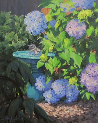
So here is my recent painting "Birdbath and Blossoms". I was pretty happy with how it turned out.

I tend to stick pretty close to the reference when I'm painting. But, I do try to adjust things to suit my composition and to try to express my personal reaction to the scene.

Identifying the focal point and the light source and direction are really key.

I knew I wanted the scrub jay to be my focal point. So I wanted to create higher contrast in that area, and use the background to create some lines leading to him.

The secondary focal point is the beautiful Hydrangeas. 

So here is what the reference photo looked like:

I think you can see the changes I made -

The bird is a bit bigger to make him more obvious, and I used higher contrast and more detail in this area.

The color in the hydrangea is more saturated

The bush to the left in the background is darker to push it back further and bring more attention to the bird.

I simplified and darkened the ground to make it less obvious. Especially behind the foreground shadowed plant. I didn't want that high contrast of the leaves against the lit ground to draw attention and lead the eye right out of the painting.

I darkened the light on the base of the birdbath and simplified the pattern. Again, to not have this area compete with the top of the bath where the bird is. Even though I liked the patterns they made - edit, edit edit!

So with  those things in mind, I painted. Now comes the important part. Set the reference photo aside! Don't look at it any more! Just look at the painting itself and let it speak to you as a painting, not a photo. So after the cool down these are the things bugging me. Let's see if they are the things that strike you, too.

1. The area of the flowers near the ground, and the light and texture on the ground are really drawing my eye and competing with the focal area. Especially the ground texture. My eye is jumping back and forth from the bird to the ground.

2. The bird is facing toward the edge of the painting. Leading our eye out. This is a rookie mistake! Ha! I thought about repainting him facing in, but I don't have enough information about the right side of the bird in the photo because it is obscured by the leaves. The other technique when you have a situation like this is to use strong visual stops. Something that blocks your line of sight and leads you back in and around the painting.

3. The leaves and flowers around the bird have more impact than the bird.

4. the edge of the birdbath feels awkward - it feels like it is closer than the shaded leaves in the foreground.

5. There is a lack of integration in the color. Though I've put some reflected light in the shadows of the birdbath, and that's working pretty well, the ground seems unintegrated as do the shadow areas in the leaves.

6. The whole composition feels unbalanced with so much light on the right, dark on the left.

So here is the first version again - next to my revised version, trying to correct these issues:

1. I've darkened and simplified the ground. It isn't as interesting as before, but now it doesn't compete for attention with the focal point. This is really tough to do sometimes! I liked the texture I'd created quite a bit, but it isn't what this painting is about. I also love to show patches of light on the ground, but again, not the point here. It's so easy to fall in love with an area of your painting that isn't helping the story...

I also darkened the flowers near the ground. Leaving the highest value contrast in the focal area. There is still value shift to show the rounded forms, but the whole value range in now darker.

Do you see  how that whole area stays quiet now? It is a supporting character, not competing with the star.
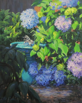
2. As a stop to the eye, keeping it from following the bird's gaze right out of the painting, I added some light leaves to the bush in the background left. These leaves are also pointing back in toward the bird. I also added one small leaf in the foreground shaded plant. It serves two purposes - one to help lead back to the bird, and the other to push the birdbath back behind it - That was problem #4 above. Do you see how your eye is directed back inward now?

3. To increase the attention and impact on the bird himself, I increased the contrast. I added lighter highlights and a few spots of darker darks. I also enlarged the darker area behind the bird and added a few more bright water drops against that dark.

4. we covered this with the overlapping leaf.

5. To better integrate the areas of color I added blues and purples to the ground, the leaf shadows as well as the foreground shaded leaves.

6. I think the addition of the light spots in the background bush serve to balance out the light and dark a little more...

So, there it is. Small adjustments that, hopefully improve the painting. I'm happier anyway!

The focal point has taken center stage, my eye moves around the painting instead of out and the whole image seems to be less flat and more 3 dimensional.

The Cool Down Period - it can take you to the next level :)


Revisiting

Ever revisit your older paintings? Not surprising, but I have a LOT of paintings hanging in my home. Some I painted many years ago. As I have learned a few more things over the years, sometimes they just bug me because I see so many things I could have done better. So I either hide them away or revisit them :) I finish my paintings with a thin coat of gloss medium, so I can just wipe the dust off and go back in and change whatever I'd like!

Here is the offending painting. Pretty sure I painted it about 6 or 7 years ago.

The first thing I do is make a list of the things that are bothering me.

1. Too Dark!!! So one of the hardest things to remember about acrylic painting is that the paint dries darker than when it is wet. So most of my early paintings are too dark. And some of my recent ones too!

2. Shadows are even Darker!!
And one of the hardest things to remember about painting from Photos is that they make the shadows even darker and you lose all the detail and interest in the shadow. While the strong contrast on the front cow is a little interesting, it is was overdone. It makes it hard to connect with the painting because you can't see his face and eyes.

3. The light is incongruous. Another big lesson I've learned - decide on your light source, direction and intensity and stick too it! I'm showing a mostly cloudy sky here, and then a strong side light from what looks like a late afternoon sun. But not evidence of it in the background trees.

4. Oh, and those background trees. Almost all the same value, color and detail. They just blend into each other and don't give us a sense of depth or 3 dimension.

5. The barns are okay, but there is a problem with their perspective. They just look wonky.

6. Big boring expanse of grass. Nuff said.

So.... Here is my rework:


 I think I covered all my issues. Better? I'm happier anyway, and I won't mind seeing it on my wall now. Unless of course it finds a new  home :)

I think it has more of a happy, contented feel to it now. Which was my experience of this place. The original was more dark and brooding and that cow was scaring me a bit :) This one is much more friendly I think.

It is 16" x 20" acrylic on canvas. $270 framed. Available in my Etsy shop or locally directly from me.

https://www.etsy.com/listing/117095219/afternoon-snack-large-original-rural


 Ready to your own revisiting and test what you have learned? Sometimes I don't do the actual repainting, I just make my list....  It can be very enlightening!

Friday, May 13, 2016

Morning Walk - A new painting

This newest painting, "Morning Walk" has been sitting unfinished in my studio for months. The reference photo I used was taken on a cloudy late winter day. The trees were bare. The cows in the photo were black. The image was flat. It was depressing! But there was something in the scene that made me want to paint it.

That's how I pick most of my subjects. By a gut feeling. Then I try to sort out what it was that I reacted to.

So I blocked in the major elements in this one. Tried a couple of different color schemes. And there it sat. What was I missing? Why did this image speak to me?

The last few months have been a bit "bare" for me. I've had the wonderful opportunity to stay home and work on my art. Time to bring to fruit all the ideas I've had in my head for years. Teaching, websites, online classes, blogging! And after a few weeks, everything seemed to dry up. Students, sales, inspiration, energy. Having been here before, I know I need to "Just Keep Painting". And above all stop thinking. But the gut feeling that tells me this is the image I need to paint has been illusive.

All the while, this image, half done, looks down on me.

Fine. Let's try again.

I took a photo of the painting and pulled it up in Photo Shop. Using my tablet and stylus I can "paint" over the image, trying different ideas and color combinations. And came up with this new take on the scene.

Life is about becoming. Transitions. Transformations. Taking the grey and imagining color. Looking at the barren and seeing lush abundance. The power in that simple act of creativity is boundless. In transforming this scene I was reminded of this. Just when I needed it.

Art gives us access to that creativity. We have different visions, different challenges, different journeys. Art keeps me focused on my own journey. Gives me the images I need, if I listen.

"Morning Walk" 16" x 20" acrylic on Canvas


available in my etsy shop: www.etsy.com/shop/karenilari

Saturday, February 20, 2016

Which Photo Should I Choose?

Choosing a photo for a successful painting...

I love to paint from photos. They capture an instance in time. I can study the effects of light and shadow - without them moving! I can paint things that would never sit still for a life painting session - like kids and pets! I can zoom in to understand value, color, form.

The great thing about painting a photo, is that you can move things around, leave things out, add things. The photo doesn't have to be perfect! You can even combine a few different shots that have different elements you are looking for.

While the photo doesn't need to be perfect, there are some important things that will make your painting process easier and more successful.  Here are some things to think about, and some mistakes to avoid.
  
Connection
Choose something that touches you personally.  Preferably a photo that you took. You will have other sensory memories connected to the image. Sounds, smells, sensations. All these you can use as you make the little decisions along the way to tell a story with your image.

Something that evokes an emotion in you. Touches you. You don't even need to know what it is! Not just something that you think is a nice picture. Something that makes you feel.

If you are connected to the image, your viewer will feel that and connect as well.

Light
Look for the light. Clear, distinctive patterns of sunlight and shadow are easiest, and most impactful, to paint. If the scene is outdoors - the sun lower in the sky creates most interest. Early morning or late afternoon. If indoors, like a still life or a person or pet,  a light from a bright window is nice. Slanting light like this clearly defines the forms with clear shadow and light patterns. 

By all means, don't use a photo taken with a flash. This front on lighting completely washes out your forms, makes everything look flat and uninteresting. It also washes out the color.

Here's an example of a lighting situation that is hard to paint successfully:

 Though this is a quaint little barn, and a nice scene. Using this photo would be a frustrating experience. 

There is little shift in values (darks and lights), The forms look flat and uninteresting.

Even if your subject seems really interesting, look for the light.

Especially when you are starting out, I really don't recommend trying to "make it up". It takes years of seeing the world as a painter to understand the effect light has on things. The way it affects color. The value shifts. 


Here is a scene from the same location, different view, the farmhouse this time.

The light on the building, grass and trees create beautiful patterns and help define the shapes and forms.

It adds a contrast of cool color notes against warm color notes. It creates highlighted, focal areas contrasted with more quiet, softer areas.

In the first the whole scene seems flat and dull, while in the sunlight it has form and excitement.

Detail

Whether you are planning to paint a very loose impressionistic painting, or a detailed photo realistic one, you want to start with clear, sharp detail in your photo. Then YOU can decide what to edit in, and what to leave out. You can decide what to emphasize with more detail, and what to represent with a couple of brushstrokes. If you photo has whole areas that are unrecognizable and murky, you are at a disadvantage. You won't be able to crop the photo to a smaller area, and still zoom in to see what is there.
This happens sometimes because the light is too bright and washes out the detail. Sometimes you are working with a photo you got from somewhere and it is just very small or at a low resolution. Often when someone wants a portrait painted from a small image. 

Here is an example. This photo of me looks fine small But if you enlarge it to try to understand the detail this is what happens!
The resolution and the photo itself are just too small.

When you are painting, you want to be able to see the shapes, the colors, the edges. If everything is just blurry, your painting will look the same. Not impressionistic, just blurry :)

Again, it's not about painting photo-realistically, it's about having the information you need to make your own choices.

Depth
Look for images that show distance in landscapes. Some visual clue to the space being 3 dimensional. This can be as obvious as distant mountains in a landscape, or overlapping flower forms in a floral. Something beyond your focal point, to help place it in space. It's harder to do that when your image is enclosed. It can be done, it's just much harder to create a pleasing painting.

For example, here is a photo taken across a river.
It has light and shadow, which is nice. Some lovely forms in the trees.
There are some trees behind the first row of trees, but no distance.
It creates a less interesting scene.


In this photo the colors are less rich, and on first glance it might not look as interesting.

But study it a little more and you will see it has 3 layers of distance - far hills, far riverbank, nearer riverbank and then the rocks in the foreground. This gives you the opportunity to vary your value, color and edges to create a wonderful feeling of depth. It invites the viewer to enter your painting and take a journey with you.

You can always push the color and value to create a more vibrant scene.

Foreground
This is something that goes along with Depth, and I will use the same photos - above to illustrate.
It's really nice to have something in the foreground that your viewer can stand on. It really adds to the realism. In the first photo it feels as if you are in, or on the water. I was on the other bank, but there is nothing visible to ground the viewer. 
You don't need to render the foreground in a lot of detail, but it is really helpful to have it there in the photo. It's also hard to make it up - the perspective, size and value of things close up is often not intuitive.  
Better to start with more, and then you can edit out what you don't want, or simplify. 

Color 
It is often beautiful color that attracts us to a photograph. And it is wonderful to have clear color, but it isn't the most important factor! All of these other concepts should come first. If it doesn't have light, detail, depth and foreground you will struggle. You can always push the color, or change it altogether. As long as you stick with the values created by the light and shadow patterns!
 
Taking this photo I could feel the fresh spring air and see the lovely delicate blossoms. The photo gave me information on the light and shadow, the details in the trees and flowers. But the color just didn't describe my experience of the scene. 

You can edit, focus and push color to tell your story! But you need those details as building blocks.


 Drama
It's easy to find photographs, especially browsing the internet, that are absolutely stunning. Images of vivid, rich light. Sunrises, Sunsets. Northern Lights, Rainbows, light rays filtering through clouds. Often these are the first images that inspire you to paint! And they can be done, but I really don't recommend it if you don't have a lot of painting experience. 
We can't paint with light, I wish we could! We are using opaque pigments. In order for a painter to get something lighter in value - we have to add white. Adding white also makes your color less chromatic and intense. Sooo, painting a very light, very vivid color is difficult! In the same way adding transparency to the mix, as in rainbows and northern lights. Well, it's tough. I really recommend painting the effects of light ON things, instead of trying to paint the light ITSELF. 
Now, that's not to say some color in the sky is to be avoided. It's just, as an early project, you will have more success, and less frustration, choosing something else as your main subject.

So to recap:

Look for Light and Shadow
Avoid Flash photos and overcast days

Look for High Resolution, Crisp images
Avoid small or blurry

Look for Distance and Depth
Avoid flat closed in scenes 

Look for Foreground  
Avoid floating in air or walking on water

Don't worry about Color
That can always be added

Avoid images of Vivid, Transparent Light effects.


Well, that's a few of my ideas! Hope that helps you choose a photo that will help you enjoy your painting process and be successful!  


Friday, January 29, 2016

Street Tulips - A Work in Progress

Hi everyone!

I'm having a great time these days now that I have just one day a week at the "day job".

Working a lot on my classes, both online and local. I learn something new every week. Both about the subject and about how I paint! Having to sit down and think about just how I'm doing something is really helping me streamline my own process. I even take my own advice sometimes! :)

So far my biggest challenge is making sure I find time to do my own painting! I could get up earlier in the morning, but we won't mention that!

Today I started a new larger painting - for me anyway - 18" x 24". Acrylics of course!  One in my series of images from around the neighborhood. Not that it is officially a "series", just what I've been interested in doing lately.

I thought I would post it as a work in progress, and do updates as I work on it. Might be interesting?
So here is the Block In Stage.
I'll post my reference photo, too so you can see where I'm going.
If you have any comments, questions or see something off - let me know!

The Reference Photo:
 T

So here is the block in. Just big flat shapes, focusing on the value of each area. Also knows as the "ugly stage" :) Just using a 1/2" wide flat brush. My next step will be another layer of block in. Refining and adjusting the values and large shapes, but avoiding any detail.

I want to have some busyness in the background, but will probably keep the colors all pretty neutral so the tulips will pop more. Surrounding rich color with neutrals is a great way to give them more emphasis. The grey asphalt of the street is a natural for that.
------------------------------------------------------------------------------
------------------------------------------------------------------------------

Next step - still using only a 1/2" wide flat brush. You want to use one that is fairly stiff at this point. Not a bristle, something with a nice sharp edge.

Here I've worked on the background. Breaking the large shapes into smaller shapes. Still focusing on value, but now trying to refine the color as well.

It will be trial and error to see how much detail I want to add back here. I do know that I will want to keep it fairly quiet so the tulips can take center stage.

----------------------------------------------------------------------------- 
-----------------------------------------------------------------------------

Next step - Starting to work on the tulips a bit. Just the yellow ones at this point. Adding some darks and brighter greens to the foliage

Still just using the 1/2 wide flat brush.

Breaking the larger shapes into smaller shapes. Refining the color and the shapes. Looking for those shadow colors mid tone colors and light colors. Adding some dark darks to the dirt in the foreground, as well as some areas in light. Refining the shapes of the shadows by painting the light colors back into the darker colors on the sidewalk.

I'm really trying to keep to big shapes, move around the canvas. Just focusing on refining the color and shapes...

----------------------------------------------------------------------------
----------------------------------------------------------------------------
Next update:

Mostly worked on the orange and pink tulips, the road, and a little on the foliage.
Still just using the 1/2" flat brush

-----------------------------------------------------------------------------
-----------------------------------------------------------------------------

Moving on to the background now. Using a small round bristle brush and a small flat synthetic brush to create layers of foliage texture. Thinking now about edges. Softer blended ones in the back, crisper in places as I come forward.

Keeping with the values and colors I established in the last steps. I did decide to go darker with the brownish tree behind the pink tulip. The value was too light there and I felt like it was competing with the lightness of the tulip. The whole plan with the background area is to provide a dark neutral area so that the light colorful tulips will pop.

I want a sense that this is a real place, but just enough detail to give that impression.

Breaking the bigger shapes into smaller shapes. Creating texture in each area by layering different colors of the same value.

I can see I need to make some adjustment to the sidewalk on the right - it looks like it is going up, but the road seems to be going down! Ha.

Anything else stand out as looking weird to you?


------------------------------------------------------------------------------------------
Okay, Here is the final :) Hope you enjoyed the process...
"Street Tulips" 18" x 24" acrylic on canvas.


-
It's available in my Etsy shop: Street Tulips Etsy Listing

Thanks for watching!
Karen

Friday, January 22, 2016

Wet vs Dry - Acrylics Dry Darker - The Proof!

So one of the things we deal with when painting with acrylics is that they dry darker then they seem when they are wet.

How many times have you walked away from a canvas thinking your highlights are just right, your value shifts between light and shadow are just right. And a couple of minutes later they are gone! I know I have!

This is because the acrylic medium that is mixed with the pigment to make acrylic paints is a little opaque when wet - and then drys clear.

It's hard to pin this down because it isn't the same for all colors, so I thought I would try an experiment.

I used gessoed canvas and these paint colors in Golden regular heavy body paints:

Napthol Red Light
Hansa Yellow Medium
Ultramarine Blue
Titanium White

I made rectangles of each color, using a double layer so I would be sure to cover the white canvas.

I added white to these and made more rectangles of paint in different values of the same color.

After letting them all dry, I used the exact same mix and brushed the wet paint over the dry and took a photo immediately.

The dry paint is on the left, the wet paint is on the right.

So this is what I saw:

First with Napthal Red Light:

  The first thing you can notice is that there is virtually no difference with the pure tube color. In fact, the paint on the right - which is wet - looks a bit darker. Because this is a fairly transparent paint, and there is still some of the white of the canvas showing through on the dry paint. The wet paint added a third layer and covered the canvas more.

The middle one with white added also shows very little shift (the wet stroke is always on the right)

The last sample, with quite a bit of white added shows a significant shift in value from dry to wet. It's pretty obviously lighter on the right!

Next with an Orange made by mixing Napthol Red Light and Hansa Yellow Medium


You can see again that the pure color, with no white added shows no discernible shift. In fact it looks a little darker again. I went one more step, adding even more white in this one.  You can still see the shift on the lightest one, but I think the second and third show a more distinct shift. This really does affect your outcome, especially when you are adding highlights. I can't tell you  how many times I've added light highlights (I thought) only to come back and they seem to have disappeared!

Another interesting thing to note on this sample. My mixture of red and yellow to make this orange looked very similar to the red in the pure form. But notice how different the color looks when you add white?

Next is Hansa Yellow Medium
Again, no visible shift in the pure tube color. Even in the lightest version, the shift is not that big. Interesting! Hansa yellow is not a strong color. In mixes you have to add proportionally more of it to get it to show up.

Next is Green made by mixing Ultramarine Blue and Hansa Yellow Medium

 I did 4 values again with the green. It's a color we use a lot in landscapes, so I wanted to see more variation. Again - no shift in the tube color. With the center samples showing the most shift. Though when you look at that last one, there still is quite a shift. The wet part looks almost white, while the dry is distinctly darker. That darkest green is sure dark isn't it? Great for making rich darks in your landscape.

Ultramarine Blue


 Again, a fairly transparent color from the tube, so even after 2 coats of paint on the left, the wet paint on the right is still darker because it is covering more of the canvas. Our pattern seems to be pretty consistent! No wonder my sky always looks too dark!!

Lastly, a Purple made from Ultramarine Blue and Napthol Red Light

Again - what a great dark, right? It almost looks brown. And yet add a little white and it's a beautiful color! And again, the lighter - more white added - the more visible the light dark shift is.

So, this was a great experiment for me! I say all the time in my classes "Remember,  acrylic paints dry darker!"  And now I can show you just how much!

  • So the pure tube colors don't shift much. In fact the transparent ones may look lighter - just because there is more of the canvas showing through and a double layer of the same paint will cover more.
  • The more Titanium white you add, the greater the value shift from wet to dry!
  • When you mix those very light colors, like for sky and highlight, don't be afraid to go very very light! What looks almost white wet will dry obviously darker!
Good to know! Hope this helps you visualize this shift better...