I love to paint from photos. They capture an instance in time. I can study the effects of light and shadow - without them moving! I can paint things that would never sit still for a life painting session - like kids and pets! I can zoom in to understand value, color, form.
The great thing about painting a photo, is that you can move things around, leave things out, add things. The photo doesn't have to be perfect! You can even combine a few different shots that have different elements you are looking for.
While the photo doesn't need to be perfect, there are some important things that will make your painting process easier and more successful. Here are some things to think about, and some mistakes to avoid.
Connection
Choose something that touches you personally. Preferably a photo that you took. You will have other sensory memories connected to the image. Sounds, smells, sensations. All these you can use as you make the little decisions along the way to tell a story with your image.
Something that evokes an emotion in you. Touches you. You don't even need to know what it is! Not just something that you think is a nice picture. Something that makes you feel.
If you are connected to the image, your viewer will feel that and connect as well.
Light
Look for the light. Clear, distinctive patterns of sunlight and shadow are easiest, and most impactful, to paint. If the scene is outdoors - the sun lower in the sky creates most interest. Early morning or late afternoon. If indoors, like a still life or a person or pet, a light from a bright window is nice. Slanting light like this clearly defines the forms with clear shadow and light patterns.
By all means, don't use a photo taken with a flash. This front on lighting completely washes out your forms, makes everything look flat and uninteresting. It also washes out the color.
Here's an example of a lighting situation that is hard to paint successfully:
Though this is a quaint little barn, and a nice scene. Using this photo would be a frustrating experience.
There is little shift in values (darks and lights), The forms look flat and uninteresting.
Even if your subject seems really interesting, look for the light.
Especially when you are starting out, I really don't recommend trying to "make it up". It takes years of seeing the world as a painter to understand the effect light has on things. The way it affects color. The value shifts.
Here is a scene from the same location, different view, the farmhouse this time.
The light on the building, grass and trees create beautiful patterns and help define the shapes and forms.
It adds a contrast of cool color notes against warm color notes. It creates highlighted, focal areas contrasted with more quiet, softer areas.
In the first the whole scene seems flat and dull, while in the sunlight it has form and excitement.
Detail
Whether you are planning to paint a very loose impressionistic painting, or a detailed photo realistic one, you want to start with clear, sharp detail in your photo. Then YOU can decide what to edit in, and what to leave out. You can decide what to emphasize with more detail, and what to represent with a couple of brushstrokes. If you photo has whole areas that are unrecognizable and murky, you are at a disadvantage. You won't be able to crop the photo to a smaller area, and still zoom in to see what is there.
 This happens sometimes because the light is too bright and washes out the detail. Sometimes you are working with a photo you got from somewhere and it is just very small or at a low resolution. Often when someone wants a portrait painted from a small image.
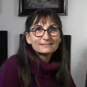
 Here is an example. This photo of me looks fine small But if you enlarge it to try to understand the detail this is what happens!
The resolution and the photo itself are just too small.
When you are painting, you want to be able to see the shapes, the colors, the edges. If everything is just blurry, your painting will look the same. Not impressionistic, just blurry :)
Again, it's not about painting photo-realistically, it's about having the information you need to make your own choices.
Depth
Look for images that show distance in landscapes. Some visual clue to the space being 3 dimensional. This can be as obvious as distant mountains in a landscape, or overlapping flower forms in a floral. Something beyond your focal point, to help place it in space. It's harder to do that when your image is enclosed. It can be done, it's just much harder to create a pleasing painting.
For example, here is a photo taken across a river.
It has light and shadow, which is nice. Some lovely forms in the trees.
There are some trees behind the first row of trees, but no distance.
It creates a less interesting scene.
In this photo the colors are less rich, and on first glance it might not look as interesting.
But study it a little more and you will see it has 3 layers of distance - far hills, far riverbank, nearer riverbank and then the rocks in the foreground. This gives you the opportunity to vary your value, color and edges to create a wonderful feeling of depth. It invites the viewer to enter your painting and take a journey with you.
You can always push the color and value to create a more vibrant scene.
Foreground
This is something that goes along with Depth, and I will use the same photos - above to illustrate.
It's really nice to have something in the foreground that your viewer can stand on. It really adds to the realism. In the first photo it feels as if you are in, or on the water. I was on the other bank, but there is nothing visible to ground the viewer.
You don't need to render the foreground in a lot of detail, but it is really helpful to have it there in the photo. It's also hard to make it up - the perspective, size and value of things close up is often not intuitive.
Better to start with more, and then you can edit out what you don't want, or simplify.
 Color
Color It is often beautiful color that attracts us to a photograph. And it is wonderful to have clear color, but it isn't the most important factor! All of these other concepts should come first. If it doesn't have light, detail, depth and foreground you will struggle. You can always push the color, or change it altogether. As long as you stick with the values created by the light and shadow patterns!

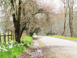
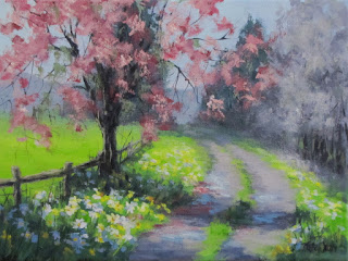
Taking this photo I could feel the fresh spring air and see the lovely delicate blossoms. The photo gave me information on the light and shadow, the details in the trees and flowers. But the color just didn't describe my experience of the scene.
You can edit, focus and push color to tell your story! But you need those details as building blocks.
It's easy to find photographs, especially browsing the internet, that are absolutely stunning. Images of vivid, rich light. Sunrises, Sunsets. Northern Lights, Rainbows, light rays filtering through clouds. Often these are the first images that inspire you to paint! And they can be done, but I really don't recommend it if you don't have a lot of painting experience.
We can't paint with light, I wish we could! We are using opaque pigments. In order for a painter to get something lighter in value - we have to add white. Adding white also makes your color less chromatic and intense. Sooo, painting a very light, very vivid color is difficult! In the same way adding transparency to the mix, as in rainbows and northern lights. Well, it's tough. I really recommend painting the effects of light ON things, instead of trying to paint the light ITSELF.
Now, that's not to say some color in the sky is to be avoided. It's just, as an early project, you will have more success, and less frustration, choosing something else as your main subject.
So to recap:
Look for Light and Shadow
Avoid Flash photos and overcast days
Look for High Resolution, Crisp images
Avoid small or blurry
Look for Distance and Depth
Avoid flat closed in scenes
Look for Foreground
Avoid floating in air or walking on water
Don't worry about Color
That can always be added
Avoid images of Vivid, Transparent Light effects.
Well, that's a few of my ideas! Hope that helps you choose a photo that will help you enjoy your painting process and be successful!


It is refreshing to see an artist whose work I admire feel that strongly about using photographs. Many artists shun the practice in favor of onsite sketches and I often feel guilty using just photos. Personally, I think BOTH are useful and often augment each other.
ReplyDeleteThanks Karen, for useful tips in using photographs. I will look at them differently in the future.
Thanks Mike. I do plein air painting as well, love doing both. It's nice to have lots of options!
DeleteKaren - once again, you have "shed light" on a complex subject - making it more clear. Thank you. I have encountered some of the difficulties you describe when trying to paint from photos. I am not a photographer and many of my pictures are taken of beautiful scenes, but don't lend themselves as a good subject for a painting. Now I know why. This is very helpful!
ReplyDeleteThank you Sarah - so glad it is helpful!
DeleteGreat, informative summary of things to think about as you select a photograph to paint. Thanks Karen!
ReplyDelete