The Magic of Values in the Acrylic Landscape. Class #2
by Karen Ilari
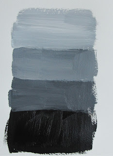
Develop your 5 Value Block In to Full Value
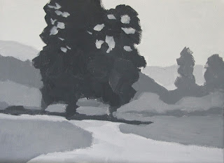
After our last class, we now have our large shapes of solid value in the right
locations on our canvas. Yours should look something like this:

Keep these things in mind:
- All you need to do is break the LARGE shapes into SMALLER shapes.
- Maintain the same overall VALUE in the area.
- Just refine the shapes to more accurately match your reference.
- Think about SIZE, SHAPE, and PLACEMENT of each spot of value
- Still using the same 1/2" flat brush.
- Don't think about DETAIL, just breaking down the large shapes into smaller ones.
- Pay attention to the EDGES of your shapes. Should they be soft and blended or hard and crisp?
- Take your time. Study what you really see in your reference. Don't assume anything. Really look at what is there paint it the way you see it.
EDGES
What does that mean?
Instead of thinking about the image you are painting as THINGS - trees, bushes, flowers. I want you to think of them as SHAPES with a certain VALUE, COLOR, EDGE, SIZE and PLACEMENT.
We've been learning about Value, and the others are pretty easy to understand. But what do I mean by EDGES? Let's take a minute to talk about this some more: Here is a close up from our reference photo:
Now. SQUINT YOUR EYES as you look at this.
Do you see the hard edge between the tree trunk and the background field? You can clearly SEE the edge. It is crisp and distinct.
Look at the foliage in the tree. Do you see how these edges are less distinct - the blend together more.
Look at the edges of the shadow of the trunk lying on the ground. Do you see how the edges of this shape are softer? Compare that edge to the bottom edge of the trunk just above it
Here is another example:
Look at the edges of the shapes in the background mountain. They are soft and blended. Do you see as you come forward in space, your edges become more distinct, but not as sharp as the edges in our foreground.
Now. That is what we see in our reference photo.
Now we have to USE this reference and EDIT it to tell OUR STORY.
Edges can be a powerful tool to:
- create emphasis in your focal point with crisp, distinct edges
- lead the eye through your painting with strategically placed crisp edges
- de-emphasize a less important area by softening the edges
- create a stronger sense of distance by softening edges even more than you see
- Create subtle gradations of value and color by softening the edges between the shapes
- describe the texture of an object- how hard or soft it is. Hard objects create crisper edges
Exercise #1
EDGES
Supplies: Mars Black and Titanium White Heavy Body Acrylic Paint.
flat synthetic brush - about 1/2" wide
water container, paper towels, palette
watercolor paper How do I do get a soft edge with Acrylics?
Using your watercolor paper, and your black and white paint. Let's practice some edges
The key to soft or blended edges in acrylics is understanding how much wet time you have before the paint dries. This is something you will get a feel for the more you paint.
In general:
- Work Quickly, in small areas
- For Larger areas - like a sky - Use larger brushes.
- Lay down a shape, adjust the edges right away.
- Be sure to work over at least one layer of paint - your block in
- Use a good quantity of paint
- Rinse your brush often
- Use a light touch
- Adjust the wetness of your brush with a paper towel
 So on your paper. Make some rectangles of different shapes like this. Let them dry.
 Now lets make some blended edges between these. There are three ways:
One Value (or color)
1. Lay down a shape of just one value - blend the edge RIGHT AWAY
2. Rinse your brush thoroughly. Blot on a paper towel.
3. Use a scrubbing motion from the dry side into the wet side to soften the edge
Two Values (or colors)
1. Mix up the two values that you want to blend
2. Paint in your two shapes. If the shapes are large, just do a smaller section at a time.
2. QUICKLY rinse your brush and blot it to damp.
3. Use a sweeping motion to blend the still wet patches
Three Values (or colors)
1. Mix up a shade between the two values you are trying to blend
2. Lay it down on the blending area
3. Rinse your brush thoroughly. Blot to damp.
4. Use the scrubbing motion as before to blend each side of the new patch.
In all methods. Finish off by cleaning your brush thoroughly, blotting to damp, and very lightly sweeping across the area to blend. Wiping often on a towel to remove excess paint picked up.
Click here for a short video demo of blending edges
So now let's practice those different edges as we finish our full value block in of our painting
When you are done, you should have something like this:
You may notice that I've made further refinements to my 5 value block in:
- The field behind the tree is lighter to add more contrast to the dark tree form and draw more attention to my focal point.
- The shape of the tree and shadow have been developed and refined.
- The value shift between the field and wildflowers have been blended and minimized.
Click Here for Lesson #3- How do we translate this to COLOR?!
And please feel free to share your progress and comments!


Karen, these two lessons are teaching me so much! Thank you. I was at a seminar this past weekend on laying out your paintins and they taught the same things you did, especially about value, laying out general shapes with the value and then moving on in your painting from there. They also stressed the importance of doing a few sketches of our paintings so we could actually compose things to our own taste and make the paintings our own creation as we really look at what is there. All foundations you teach. Thanks again for sharing. Sherrie McAllister
ReplyDeleteYou are very welcome Sherrie!
DeleteJust brilliant!
ReplyDeleteThanks so much Yvonne!
DeleteThis comment has been removed by a blog administrator.
ReplyDeleteHaving never done this level of detail in value study before, I am unsure if it is "enough" or not, but my gut says yes. On to class 3. Practice practice practice!
ReplyDeleteYou basically want it to look like a black and white version of the final painting!
ReplyDeleteTaking the values this far is not something you would do with every painting you paint, but a really valuable exercise in training your eye to see and match values.